
book (design) story #106
otl aicher:
typographie
druckhaus maack, lüdenscheid; ernst & sohn verlag, berlin, 1988
printer: druckhaus maack, lüdenscheid
size: 30 x 29 cm
designer: otl aicher
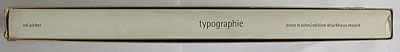
"typographie" by otl aicher (1922-1991) is one of the classic books on the subject, also because its design demonstrates what aicher is writing about. again aicher used lots of white on the dustjacket and slipcase – looks nice, but is not very practical: it really shows the dust...
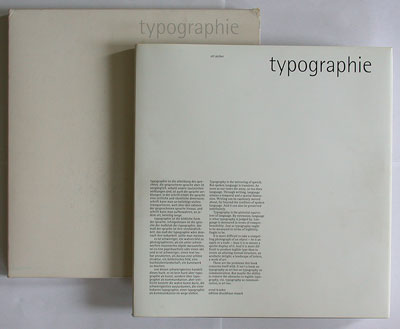
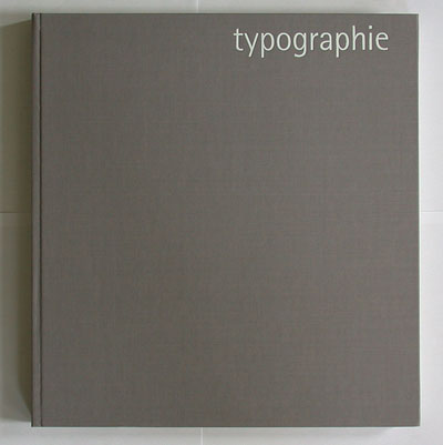
the title appears in the same style on the case, jacket, and grey cloth cover.
below the laid-in publisher's leaflet about the book project. the logo (top left) shows a (aquite abstract) gryphon with two gutenberg-style ink pads – an old symbol of the printing trade. violet endpapers are the only colour in the otherwise black, white, and grey book.
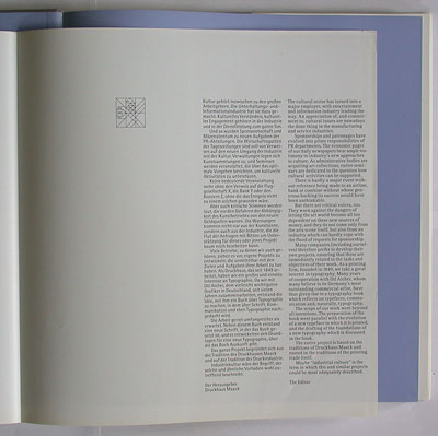
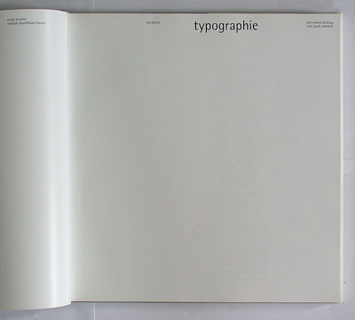
the title page: lots of white space, as usual.
the book has bilingual text in german and english running parallel in columns. aicher used his "rotis" typeface family (and also writes about it): interestingly, german text is set lower-case in "rotis semigrotesk" (semi sans), english text mixed-case in "rotis antiqua" (serif roman) .
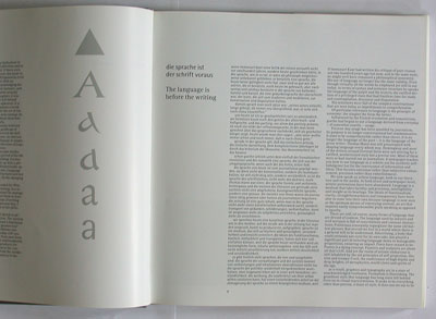
the phenomenon of written langague is explored from a very multi-cultural point of view – quite a difference to tschichold's eurocentric "anti-nationalism" in 1928 (story 29).
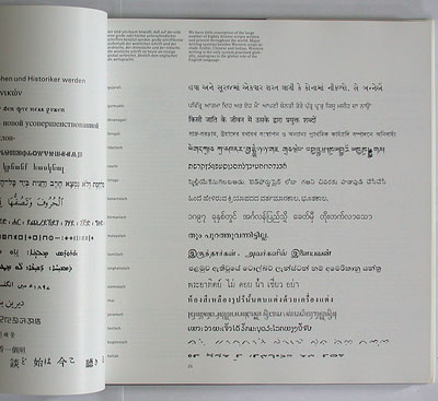
below some examples of what aicher considers "bad" post-modern typography: geometric formalism – maybe funny, but lacking easy readability.
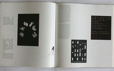
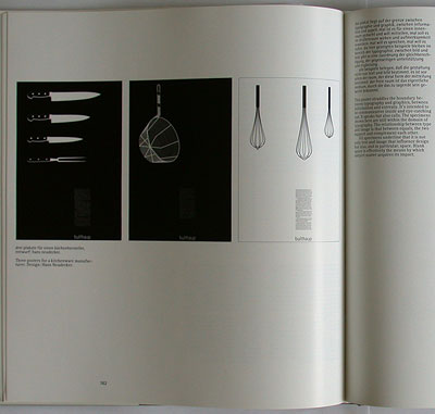
examples of "good" modern posters, designed by hans neudecker (see story 105) for kitchen manufacturer bulthaup (see story 104).
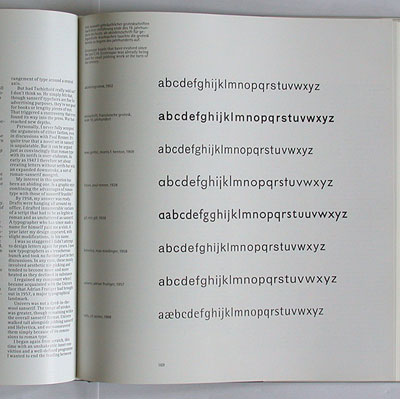
we learn about the development of modern sans-serifs – from akzidenz-grotesk to rotis.
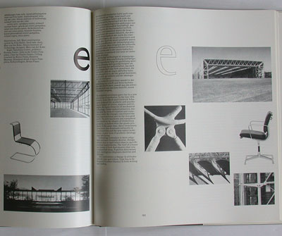
aicher discusses the concept of "functionalism": while the modernist movement of the 1920s believed in simple geometric forms (paul renner's futura typeface), today's advanced technologies allow for a more complex relationship between form and function (rotis typeface).
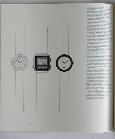
not all typographers like aicher's rotis typeface and his book design style – but to know about his ideas and theories is still a must. below: watch dials demonstrate aicher's concept of "analogous" vs. "digital" (design) philosophy.
--------------------------------------
book (design) stories home
index of published book (design) stories