book (design) story #12
max bill:
robert maillart
verlag für architektur ag., erlenbach-zürich, 1949
size: 21 x 21 cm
designer: max bill

robert maillart (1842-1940) is one of the great engineers of all time, famous for his elegant bridge constructions. this poet of reinforced concrete was born in bern, and some of his most beautiful bridges were built in switzerland. nine years after his death, this wonderful little book about his work was compiled by the swiss artist, designer and architect, max bill (1908-1994).

in the 1930-40s max bill was the author and/or designer of several important modern architecture books published by hans girsberger (and the "verlag für architektur" girsberger was involved in).

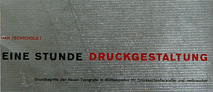
this book shows that bauhäusler bill is firmly rooted in the design innovations of the late 1920s. the black and white photo overprinted with a red line drawing is a design idea very similar to tschichold's cover shown here. the semicolon after the author's name is also often seen in tschichold's book designs of the 1930s. ironically, just three years before the maillart book was published, bill and tschichold had their famous quarrel: bill attacked tschichold for dropping the "asymmetric typography" that bill (and other swiss typographers) adhered to.

note this odd detail on the jacket's spine: the two names are reversed to "robert maillart : max bill" – who is whose author here?

in 1955 an extended edition of the book was published. interestingly, the design of the cover and dust jacket was changed. the overlapping montage was replaced by a single photo, and the tschicholdesque semicolons were gone.

bill used the same square format and sans-serif design (with a microscopic 6 pt type for text and captions in three languages) in his 1952 book "form" (see story 3).

a 3rd edition was printed in 1969. the book was identical to the 2nd edition, except for the red jacket – and all pages were now offset printed on white coated paper, while in the previous letterpress printed editions greyish paper had been used for text pages.

i also have two personal associations with this book: max bill grew up in winterthur, not far from where i live now. and one of the bridges featured in the maillart book is in winterthur, too. it is aptly described by max bill:
the foot-bridge over the töss in winterthur-wülflingen was designed in collaboration with engineer w. pfeiffer, winterthur. the solution arrived at here can hardly be surpassed for its elegance. (...) the structure has the ease and pleasant naturalness as it had grown there and had sought to span the river itself.

unfortunately, one end of the bridge was altered when the road next to it was enlarged. a few years ago this 70-year-old bridge was renovated. now the concrete looks almost as white again as on the photo in the book.

--------------------------------------
book (design) stories home
index of published book (design) stories
