
book (design) story #185
franz schauwecker:
deutscher almanach für das jahr 1934
philipp reclam jun. verlag, leipzig, 1933
printer: philipp reclam jun., leipzig
size: 18 x 11 cm
designer: paul renner
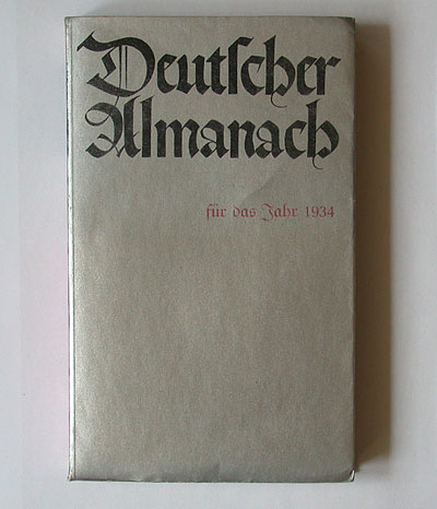
in story 170 we showed reclam's "deutscher almanach" for the year 1933 designed by georg salter. this is the issue for the following year, printed in 1933. now, blackletter rules – the typeface family favoured by the nazis until 1941.
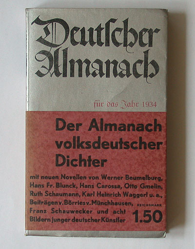
however, the original belly band is printed in a bold sans-serif on red.

the book designer is paul renner (1878-1956) who was sacked from his post as director of the munich meisterschule the same year. the cover title is in the style paul renner used for his early (pre-1920s) book designs – a masterpiece of hand-lettering! flashy silver-coloured jackets you can also find in jan tschichold's book designs (see stories 73 and 129).

for the title renner used the elegant "unger fraktur" typeface – a favourite of his in his early work and very different from the notorious "schaftstiefelgrotesk" (jackboot blackletter) typefaces which became popular in nazi germany. the typography is modern-asymmetrical.
however, the content is dominated by the kind of nazi ideology renner criticised in his booklet kulturbolschewismus?.

--------------------------------------
book (design) stories home
index of published book (design) stories