
book (design) story #212
erich neuss:
so ist halle – halle ist schön
verkehrsamt der stadt, halle/saale, 1930
printer: karras & koennecke, halle
size: 25 x 18 cm
photographer: hans finsler
designer: erwin hahs
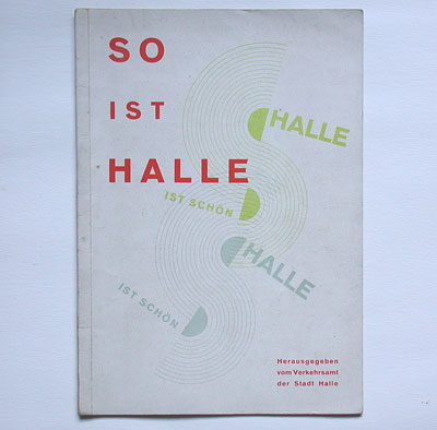
everybody knows the bauhaus, but there were other important modernist (graphic) design schools in 1920s' germany. one such place was the kunstgewerbeschule burg giebichenstein in halle. teachers of that school also designed brochures for the local tourist office such as this one: halle is like this – halle is beautiful says the cover. note the nice design based on semi-circles in olive and light grey using the same printing block. asymmetric uppercase titles in bold sans-serif are typical for early new typography (see book 29).
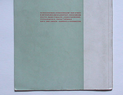
the impressum printed on the brochure's back credits: "photo: hans finsler / typographie: hass", with "kunstgewerbeschule" behind the two names.
the photographer hans finsler (1891-1972) and the painter erwin hahs (1887- 1970; born "hass", maybe he later changed the spelling of his name because it means hate) ran the workshop for advertising at the burg giebichenstein school. the texts were written by erich neuss (1899–1982), a historian who was sacked from his post as halle's city archivist in 1933.
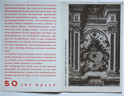
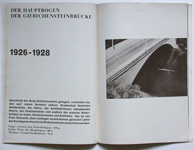
mixing of bold sans-serif and bodoni-style (didone/modern) typefaces was popular with tschichold around the same time – see book 40. below one of finslers great photographs.
--------------------------------------
book (design) stories home
index of published book (design) stories