
book (design) story #288
willem sandberg:
experimenta typografica 11
galerie der spiegel, (köln), 1956
printer: c. a. spin & zn.
size: 22 x 14 cm
designer: willem sandberg
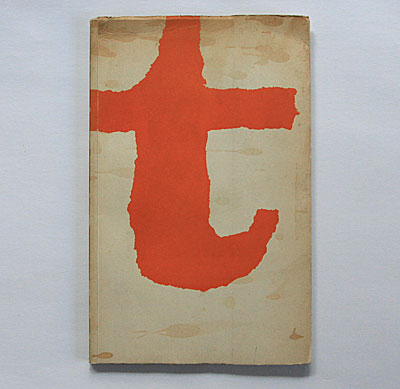
the torn paper style of this nice (but unfortunately soiled) brochure cover is unmistakably that of dutch graphic designer and museum director willem sandberg (1897-1984). this is one of the "experimenta typografica" (typographical experiments) sandberg designed during ww2 and published in this form by the galerie der spiegel. subtitle of this 1956 edition: "tektonikh / das konstruktive".
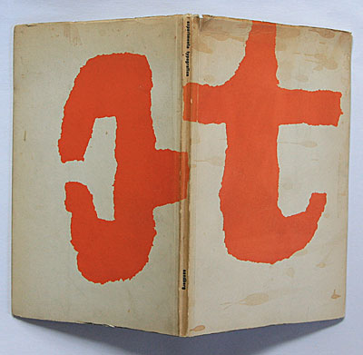
while the shape on the front cover is a clearly recognisable letter "t", what is the "thing" on the back?
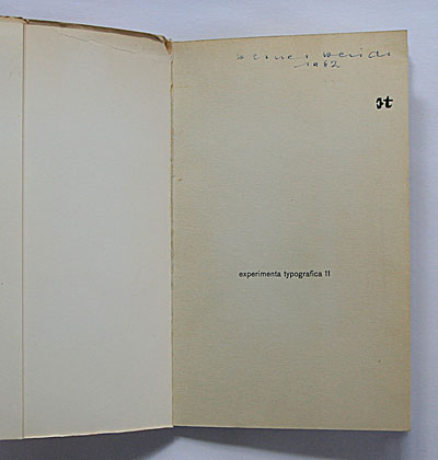
the cover design also appears very small on the title page. if you don't get the back cover "thing" – read on!
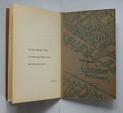
the booklet is a collection of quotes by marx, corbusier, goethe etc. in different languages (with german translations), set in distinctive typography. some pages are printed on his trademark "wholemeal" paper (also see story 242).
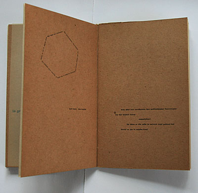
above: a german sentence is written in the hexagonal shape of a honeycomb: "but what distinguishes the worst architect from the best of bees is this, that the architect raises his structure in imagination before he erects it in reality" – a quote from "das kapital" by karl marx.
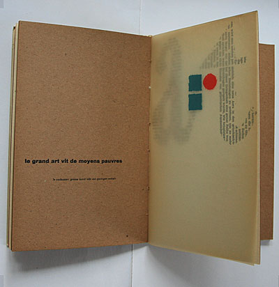
below: the sandbergian torn circle and squares on glassine paper make sense when read with the characters on the next page which look like torn from a newspaper: "art" – illustrating a le corbusier quote: "great art lives from poor means".
now look at these blue shapes below – these are two slab-serif capital "e" letters, rotated 90 degrees. do you see any similarities to the back cover "thing"?
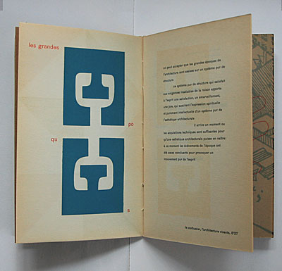
yes, the "thing" is actually a big white capital "e" on an orange background!
--------------------------------------
book (design) stories home
index of published book (design) stories