
book (design) story #292
jean cocteau:
enfants terribles
gustav kiepenheuer verlag, berlin, 1930
printer: offizin haag-drugulin ag., leipzig
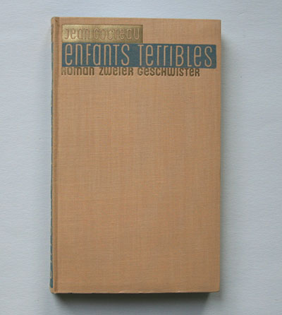
size: 18 x 11 cm
designer: georg salter (jacket + cover)
french poet, dramatist and filmmaker jean cocteau (1889-1963) published his novel "les enfants terribles" (the terrible children) in 1929, and a film was made the same year. while this german translation appeared the year after, a first english version came out as late as 1957 (title: "the holy terror"). the book tells the story of a quasi-incestuous love between a teenage brother and sister.
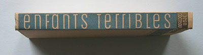
i love this cover and jacket design by georg salter (1897-1967): the unusual sans-serif typeface with a mix of "large" lowercase and "small" uppercase (reduced to x-height) seems to express the odd feelings of the teenagers – too big to be a child (lowercase), too small to be an adult (uppercase)! while the writing on the cover appears negative on blue and shiny gold, ...
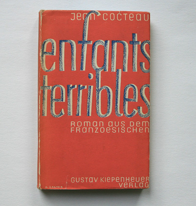
... the jacket shows salter's favourite orange/blue colour scheme. although now the title typeface is a "normal" sans-serif (lowercase), the letters are not "standing straight up" thus expressing an "uneasiness" of these children ...
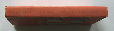
... – and also attracting the eye of the potential book buyer! a very flashy, effective graphic design which is truly modern instead of modernist in its approach. again i wonder if this "anti-aesthetic typography" design by georg salter influenced jan tschichold – in his chosing odd "dancing" title typefaces for book 163.
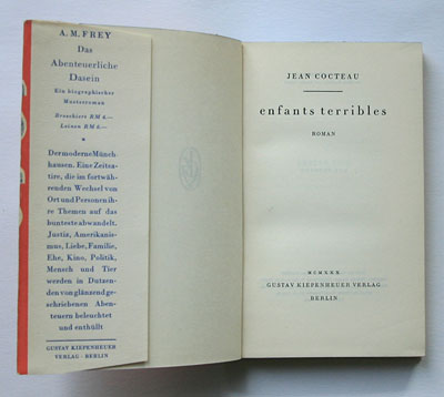
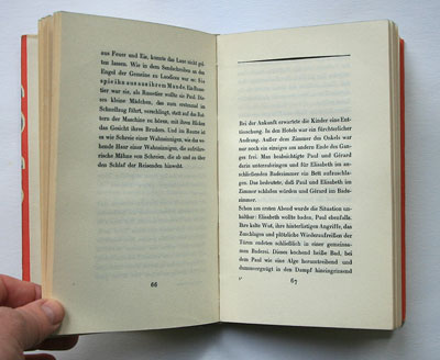
the inner pages (not by salter, as usual) show a traditional axial layout although the title is set in lowercase.
--------------------------------------
book (design) stories home
index of published book (design) stories