
book (design) story #332
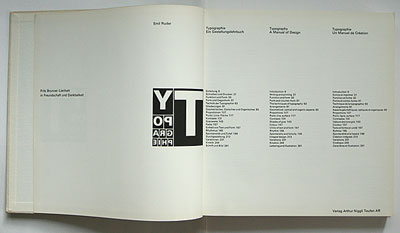
emil ruder:
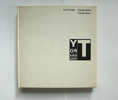
typographie
verlag arthur niggli, teufen, 1967
printer: zollikofer & co. a.-g., st. gallen
size: 24 x 24 cm
designer: emil ruder
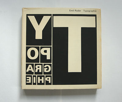
why mirror-writing on a jacket of a book on typography? people familiar with the history of printing know: this was the way a typesetter saw his work in lead type.
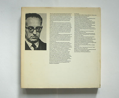
emil ruder (1914-1970) is the father of the "basel school" tradition of swiss typography.
in this influential book ruder summarised his design philosophy.
the book not only includes many fine examples of his work, but is also an excellent design example itself.
the book and some of the examples show that ruder was a big fan of adrian frutiger's sans-serif typeface "univers".
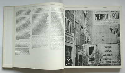
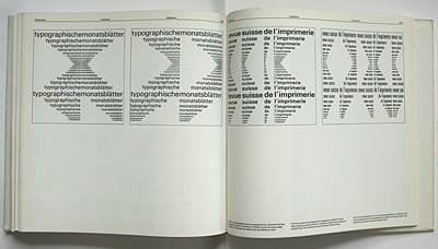
the multicolumn, multilanguage text is set unjustified.
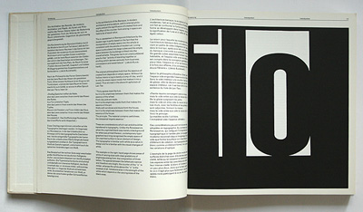
many examples illustrate ruder's design approach: he explored the expressive potential of letterforms in different weights and sizes, especially their black/white and tonal values.
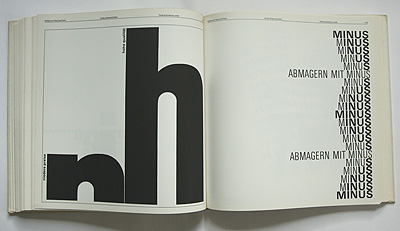
ruder's approach which could be described as "abstract painting with type forms" was different from the "zürich school" around lohse and müller-brockmann who used type in a more rigid way.
--------------------------------------
book (design) stories home
index of published book (design) stories