
book (design) story #353
max burchartz, walter witzel:
deutsch der wein
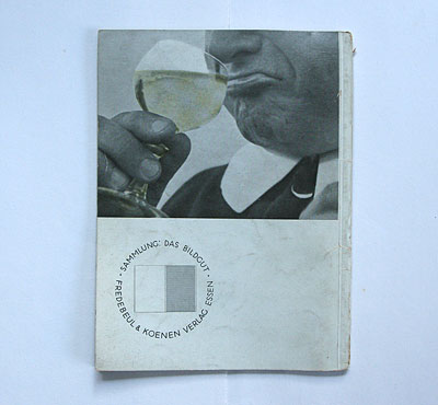
fredebeul & koenen, essen, 1933
size: 21 x 15 cm
designer: max burchartz
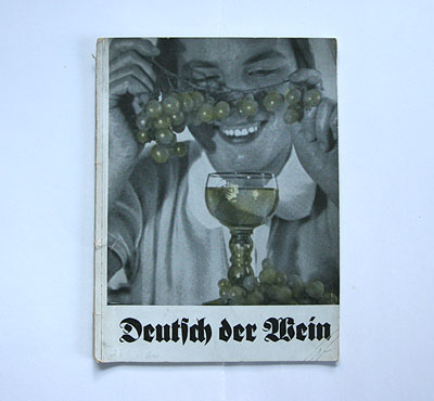
at first sight, this brochure on wine-making in germany looks modernist with its bled-off photographs (with grapes and wine tinted yellow) and asymmetric typography, ...
... if there weren't the blackletter typeface, and the nationalistic undertone in the title, "german the wine", which make clear that this pamphlet stems from the new zeitgeist of 1933 germany.
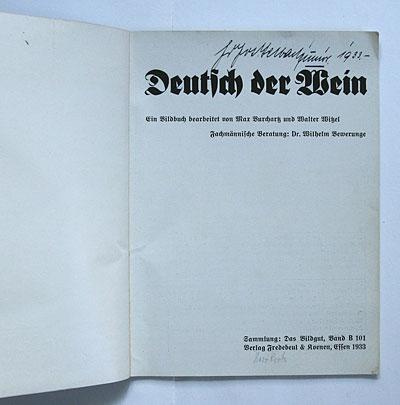
the modernist touch is not surprising if you look at the name of one of the authors/designers: max burchartz (1887-1961) was a pioneer of new typography in the 1920s, a professor at the folkwang school in essen. burchartz was one of the few prominent modernist designers who actively joined the nazis, as jan tschichold had remarked later (see story 216).
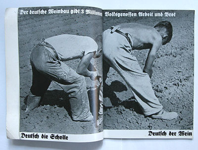
the spread above is in the typical nazi propaganda style: monumental photos of hard working germans combined with slogans in blackletter such as: "german the soil – german the wine".
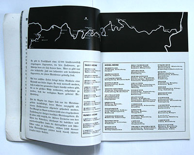
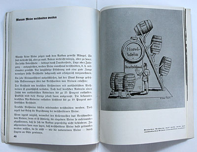
however the maps and tables of german wine areas are set in sans-serif. the illustration reveals that wine-making philosophy was also streamlined along nazi ideology: "german wine must not be blended with non-german wine!" – a german soldier stops foreign barrels to be poured into the mosel wine!
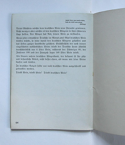
the last lines: "in these hard times for germany one should pour and drink only german wine. drink wine, drink wine! drink german wine!"
--------------------------------------
book (design) stories home
index of published book (design) stories