
book (design) story #358
wilhelm lotz, albert speer, ehmke:
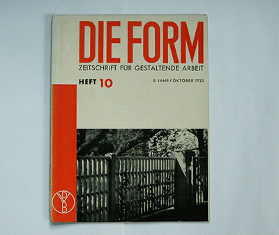
die form
verlag wendt & matthes, berlin, 1933
size: 31 x 23 cm
designer: walter dexel (cover)
the deutsche werkbund, founded in 1907, first published their monthly magazine "die form" in the 1920s. the magazine was also an early adopter of new typography.
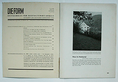
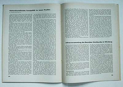
this is the october 1933 issue. while the standardised design by walter dexel (1890-1973) – he won the magazine's redesign competition in 1928 (source: "blickfang", isbn 3000147861, p.279) – still is in the modernist vein, the content clearly reveals the new zeitgeist. one articles talks about "bauhaus snobism" and applauds the fact that in some design schools "50% of the teachers were sacked which was necessary". the opening article is by an architect who became hitler's favourite: albert speer shows a villa which, not surprisingly, is no flat-roofed box ...
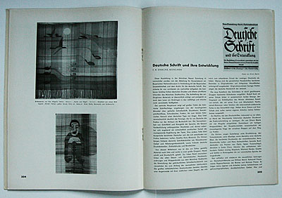
there is also an article by fritz helmut ehmke on "german script", i.e. blackletter. the report from the annual conference of the werkbund suggests that the gleichschaltung of the organisation was practically complete.
in earlier years "die form" had been published by hermann reckendorf, a (jewish) publisher who ran into difficulties by 1933 and died that year. in 1934 the nazi regime eventually put an end to the deutsche werkbund and the magazine "die form".
--------------------------------------
book (design) stories home
index of published book (design) stories