
book (design) story #38
richard wright:
wir neger in amerika
büchergilde gutenberg, zürich, 1948
size: 24 x 17 cm
designer: richard paul lohse
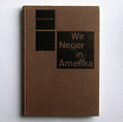
the book "twelve million black voices: a folk history of the negro in the u.s." by richard wright (1908-1960) was first published in 1941 by viking press, new york. seven years later this german translation was brought out by the büchergilde gutenberg, zürich.
richard paul lohse (1902-1988) designed many books for the swiss büchergilde in the 1930-40s. this one is a standout – it represents swiss "new new typography" in its purest form. on the brown cloth there are three black squares – asymmetrically arranged, as is the title. these squares seem to define the typographical grid lohse used inside. this edition was issued without dustjacket.
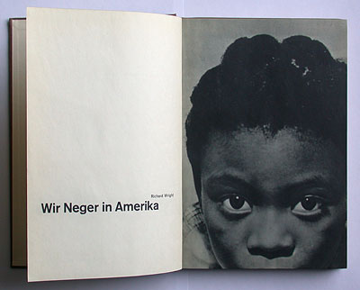
the title spread is most impressive: on the left, the title in akzidenz-grotesk semi-bold, a trademark title typeface in swiss typography at that time. the right page is a full-page bleed of a black child's face – the dark eyes are on level with the title, creating a strong contrast with the white blank space of the opposite page. the "contrast" between black and white (people) is the theme of the book that is visually expressed by its design.
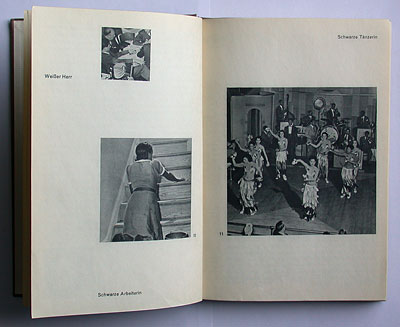
there are terrific photographs in the book, although the photographers are not credited in this german edition. they are famous now (see next story).
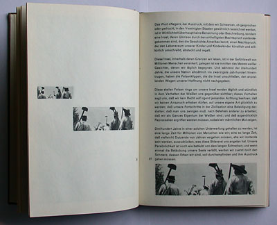
the placement of the photo material in a grid structure is one of the main achievements of swiss typography. the spread shown above repeats the same photo in three sizes, cretaing a film-like "zoom" effect. sequences of squares and rectangles in a grid pattern are also the basis of lohse's "serial and modular" paintings.
lohse's use of sans-serif type in one standardised size and weight for chapter heads, texts and captions became a characteristic feature of the swiss "neue grafik" design style (another example: story 26).
quite unusual: not only the photos but also all texts are gravure-printed, creating a wonderful unity of text and image. this technique allows for a deep and velvety black colour in photographs. the downside: the contours of the typefaces lack a certain sharpness.
lohse's design of this book was very modern at the time – in fact it was too modern for the taste of leading büchergilde officials. as richard paul lohse recalled in his memories of his life in the "zetthaus", the relationship with the büchergilde was never the same afterwards (apparently there was also a dispute about the somewhat weak german book title that was suggested by büchergilde's boss hans oprecht). it is actually lohse's last typographical design of a büchergilde book (he kept on designing dustjackets for their scientific series until 1954).
--------------------------------------
book (design) stories home
index of published book (design) stories