
book (design) story #475
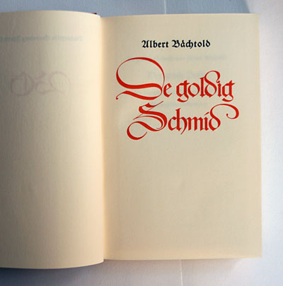
albert bächtold:
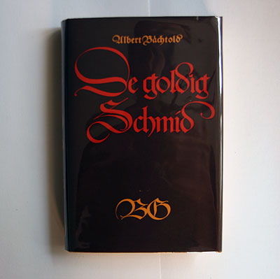
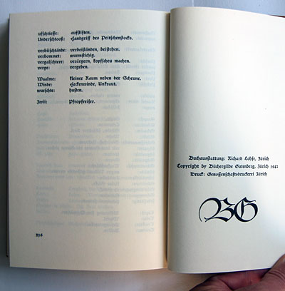
de goldig schmid
büchergilde gutenberg, zürich, 1942
printer: genossenschaftdruckerei zürich
size: 21 x 14 cm
designer: richard paul lohse
here a book design that i would not have recognised as one by richard paul lohse (1902-1988) – but the imprint (see picture below) leaves no doubt!
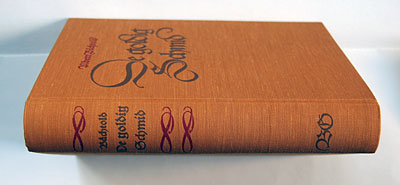
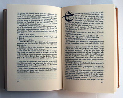
the jacket, cover and title page sport calligraphic blackletter script of the "schwabacher" variety.
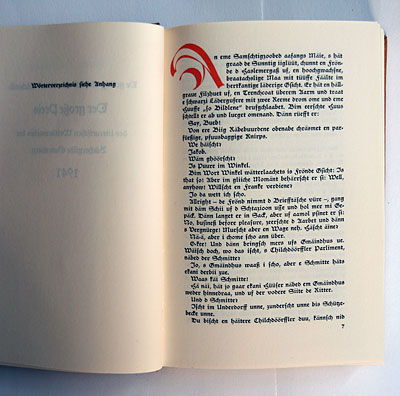
the inner pages are also set in a schwabacher typeface, with calligraphic initials. lohse was trained at the kunstgewerbeschule zürich which had a firm lettering/calligraphy tradition. we have also come across his calligraphic skills in e.g. book 118.
this rather vernacular design is a perfect fit for this story ("the golden smith") by swiss author albert bächtold (1891-1981) which is printed in a swiss german dialect!
büchergilde books like this 1943 example can be understood as part of switzerland's "geistige landesverteidigung" (spiritual national defence) against the threat posed by nazi germany at the time. interestingly, when hitler took a u-turn in his highly ideological typeface policy and banned blackletter in 1941, he explicitly (and falsely) denounced "schwabacher" as being "of jewish origin"! i don't know if lohse knew about this fact and thus deliberately chose schwabacher – as an anti-fascist typeface, so to speak...
--------------------------------------
book (design) stories home
index of published book (design) stories