book (design) story #5
lucius burckhardt, max frisch, markus kutter:
achtung: die schweiz
verlag felix handschin, basel / basler politische schriften 2, 1955
printer: buchdruckerei karl werner ag, basel
size: 21 x 15 cm
designer: karl gerstner

occasionally, even in prosperous mid-1950s switzerland a few utopic ideas cropped up. the authors of this small brochure suggested that the plans for a big national exhibition should be dropped in favour of a more audacious project: to build from scratch, on an empty field somewhere in the swiss midlands, a real-life, modern model city. crazy intellectuals?

well, one of the authors is famous today – not in his capacity of trained architect but as a novelist and playwright: max frisch (1911-1991).

the brochure's content is reflected also in the fresh look of its design. the title is cheeky: "achtung" can be read as "attention, please", but it can also mean "watch out, be careful". the eye-catching red is similarly ambiguous: is it the patriotic colour of the swiss flag? or is it signalling alert? and why is the word "achtung" spelt with a small "a" in an otherwise mixed-case text? these "incorrect" lower-case beginnings are a style repeated in all the chapter titles.

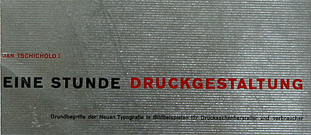
this provocative brochure is an early design by karl gerstner (1930-2017) who later teamed up with one of the authors, markus kutter, to form a successful advertising agency. looking at this booklet it is easy to see why swiss typography of that era has also been called the "new new typography": din a5 norm format, sans-serif type and asymmetric titles and page numbers are among the principles that jan tschichold had propagated in his famous 1928 book "new typography". the ranged-left, ragged-right setting of text is gerstner's preferred style. the alternating paragraph widths create a strong visual rhythm, the contrast of printed and blank areas being further intensified by the exclusive use of a semi-bold sans-serif.
the brochure made quite a splash at the time. there were several printings. attached to the rear wrapper flap there was a red reply card (copy pictured above). in the 3rd printing (copy pictured below) a loose white reply card was inserted, along with a yellow publisher's flyer (problably also designed by karl gerstner) with interesting comments by frisch, kutter and burckhardt about the reactions they got after the first two printings.

however at the end of the day its utopic idea had no chance: the "expo 1964" was to be a temporary show (as was the "expo 02" three years ago).

--------------------------------------
book (design) stories home
index of published book (design) stories
