
book (design) story #590
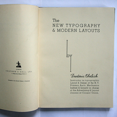
frédéric ehrlich:
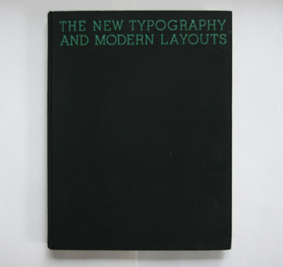
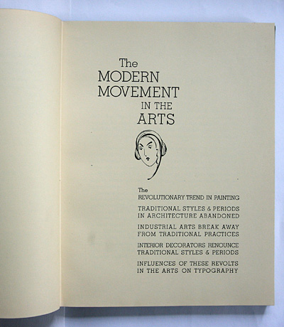
the new typography & modern layouts
chapman & hall, london, 1934
printer: de vinne-brown corp., new york
size: 31 x 24 cm
designer: frédéric ehrlich
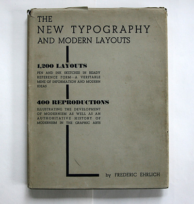
this 1934 book on modern typography and layouts is a great early testimony of how the european "new typography" movement influenced the u.s. graphic design and printing industry.
frédéric ehrlich (dates?) was a teacher for commercial design at cooper union art school in new york.
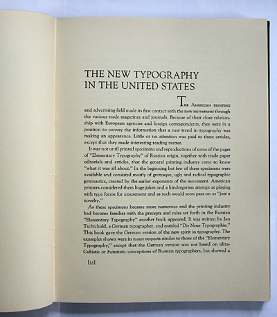
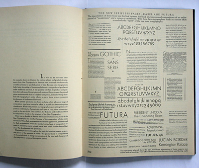
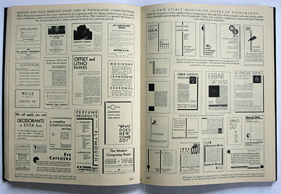
ehrlich explains how the "german version of russian revolutionary typography" – tschichold's "elementare typographie" and "neue typographie" – caused a stir among u.s. professionals: ...
... while the tradionalists thought of it as "kindergarten" stuff, others adopted some stylilistic elements, however often without deeper understanding of the principles.
ehrlich is positive about the later examples of asymmetrical balance.
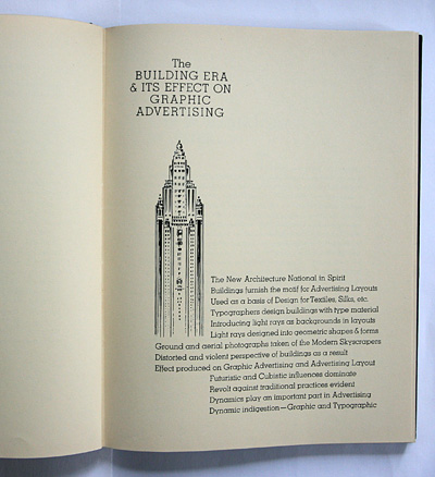
he points out the influence of modern (art deco) architecture on typography, ...
... similar to philipp albinus in book 49, ...
... while jan tschichold used to stress the influence of abstract painting.
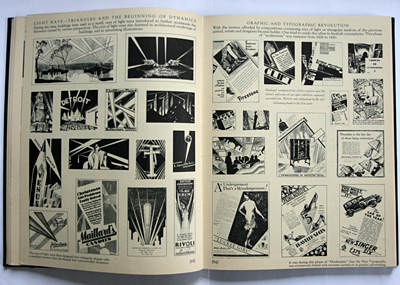
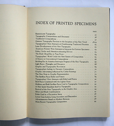
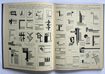
there are literally hundreds of examples ...
... although reproduced rather small in b/w only.
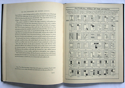
the section with layout sketches is very systematic in approach.
--------------------------------------
book (design) stories home
index of published book (design) stories