
book (design) story #711
albert bühlmann:
der weg in die tiefe
j.r. geigy s.a., basel, 1961
size: 15 x 15 cm
photographer: charly knigge
designer: (unknown)
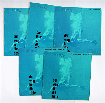
we have come across such small, square booklets of the "documenta geigy " series before, see stories 709 and 616 – all great examples of the famous "geigy style".
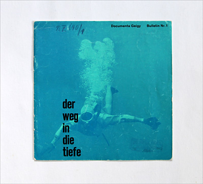
these 5 numbered "bulletins" are dated 1961, and all have the same striking blue cover with an underwater photo of a diver, with the title "the path into the depth" printed in a black, all-lowercase, condensed sansserif: the vertically arranged words literally seem to sink to the lower edge of the page, and the diver seems to go after them!

the series is about the problems of diving, with texts by albert bühlmann (1923-1994), a physician and zürich professor whose contributions to decompression science had an high impact on commercial, recreational and military diving.
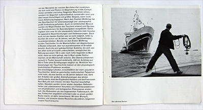
above a photo of the ocean liner "andrea doria" which sank in 1956 (see also story 17).
the author explains why divers couldn't perform the work required to lift the wreck of the "andrea doria" from 100 meters below sea level.
but why does a pharma company bother to print booklets about diving?
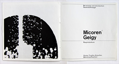
well, the series represents a pr campain for geigy's drug micoren, a respiratory stimulant: all booklets include this ad (above) which was designed by therese moll (1934-1961), see also story 652). however i don't know if the bulletins were also designed by moll.
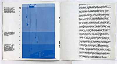
note the asymmetric page layout with sansserif type, set unjustified.
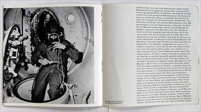
in the photo above swiss deep diving pioneer hannes keller who worked with bühlmann and successfully tested the new breathing gas mixtures they developed.
--------------------------------------
book (design) stories home
index of published book (design) stories