
book (design) story #75
ignazio silone:
der fascismus
europa-verlag, zürich, 1934
printer: genossenschaftsdruckerei, zürich
size: 21 x 14 cm
designer: max bill

this critical history of fascism in italy by ignazio silone (1900–1978, more about him in story 74) was published in 1934. the europa-verlag, run by emil oprecht, was an important publisher for anti-fascist books.
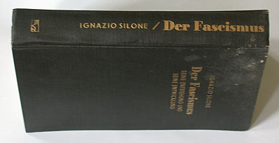
the dustjacket design is credited to "bill–zürich". like for his first silone book, max bill (1908–1994) used an extra-bold, bodoni-inspired antiqua typeface. but what a difference in style: here we have a traditional, axial arrangement – even featuring a thick-thin double rule (also called scotch or oxford rule), an element explicitly "forbidden" by jan tschichold in his famous 1928 new typography "bible"... we understand: max bill's exaggerated traditionalism is meant to be ironic, mocking the fascist's "tasteless" conservativism. the book is literally "wearing" the colour of the fascists' infamous black shirts.
paul renner probably wouldn't have approved of this design approach: a printshop is not a fancy-dress hire, he wrote in this 1930 book.

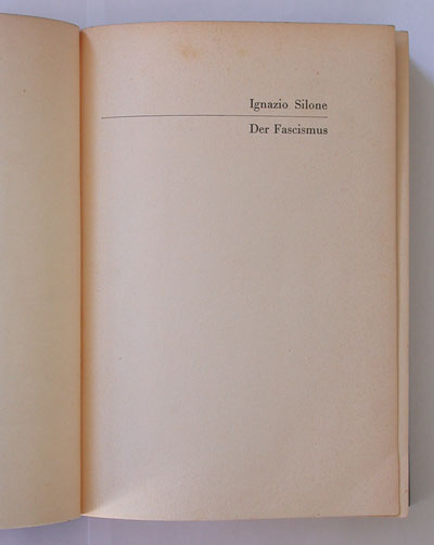
although max bill is only credited for the jacket, the inner pages show some similarties to his earlier silone book: bodoni typeface, chapter titles set flush to the outside margins (with thin rules), and no paragraph indents.

--------------------------------------
book (design) stories home
index of published book (design) stories