
book (design) stories
from new typography
to swiss style
modernist book design in germany and switzerland 1925–1965 (and beyond)
already 752 books featured – new additions:


 stay tuned – subscribe to rss feed for new additions!
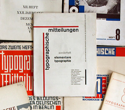
this collection is about modernist typographic design in german-language books from 1925 to 1965 (and beyond). why start in 1925? in october 1925 the german printers' trade magazine "typographische mitteilungen" published a special issue entitled "elementare typographie" (elemental typography), containing manifestos by jan/iwan tschichold, el lissitzky, laszlo moholy-nagy, and others (read story 544).
in the same year tschichold designed his first modernist book for the büchergilde gutenberg (see story 28). these avant-garde typographers created a new "functionalist" style that was influenced by modern architecture and abstract art – especially russian constructivism and dutch de stijl –, and adopted elements of experimental futurist and dada typography. books were no longer to be old-fashioned, leather-bound status symbols for the middle and upper classes, but have a modern, dynamic, machine-age look – which meant: asymmetric layout, no-frills typefaces such as sans-serifs, and "objective" photographs or photomontages.
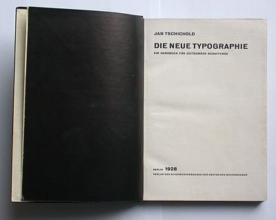
in the following years, innovative schools such as the bauhaus in dessau or the meisterschule für deutschlands buchdrucker in munich – and books like tschichold's seminal "die neue typographie" (see story 29) – had a significant influence on book design in germany. this movement came to an abrupt end in 1933 when hitler seized power: the nazis denounced modernist culture as "anti-germanic" and "jewish-marxist" (see story 1). many leading artists, designers, and publishers left the country. between 1933 and 1945 it was mainly in switzerland (and a few other independent countries) that modernist german-language books could be published.
jan tschichold played a central role in establishing a new typographic culture in germany and switzerland. in 1933 he emigrated to the swiss town of basel, where he published another influential book in 1935 (see story 30). though tschichold himself soon changed to a neo-traditional typographic style a new generation of swiss graphic artists continued to work in the modernist tradition – among them richard paul lohse and max bill who both were prolific book designers.
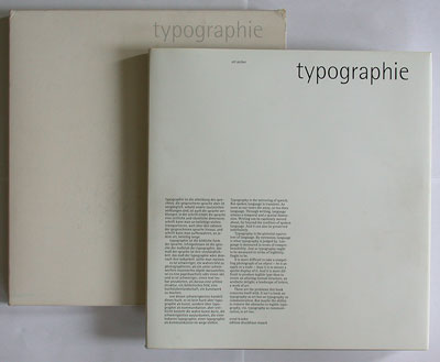
by the 1940s they started to develop what later became known as "swiss typography" – a clean, "engineered" style based on the new typography of the 1920s. in designing books – typically non-fiction, illustrated books on architecture, technology, science, society or modern art – they employed sans-serif typefaces, asymmetric layout, and a systematic grid for organising pictures and (often multi-language) text on a page. the grid layout is perhaps the most "genuinely swiss" contribution to modern typographic design.
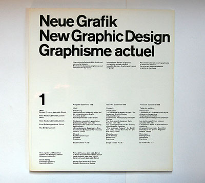
by the 1950s, swiss new graphic design had gained an international reputation – e.g. in germany where max bill became the first director of the influential hfg ulm design school (see story 3). swiss designers such as karl gerstner, josef müller-brockmann, emil ruder, armin hofmann, and others became more widely known – also for some of their books.
by the mid-1960s the "purist" swiss new graphic design movement had passed its zenith, and by the 1970s post-modern pluralism/eclecticism started to gain momentum. however, the modernist tradition lives on, as a style among others – also in book design (see story 106).
on this website you will find many descriptions and photographs of books – though, with a few exceptions, only german-language books. i suggest you start browsing the index.
--------------------------------------
book (design) stories home
index of published book (design) stories