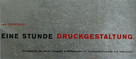
book (design) story #1
paul renner:
kulturbolschewismus?
eugen rentsch verlag, erlenbach-zürich / münchen / leipzig, 1932
printer: b. heller, münchen 25
size: 22 x 15 cm
designer: paul renner
paul renner (1878-1956) is one of the pioneers of modern typography. he is best known for his design of the futura typeface, a sans-serif still highly popular today. when renner became director of the meisterschule für deutschlands buchdrucker (masters school for germany's printers) in munich, he invited jan tschichold – then a chief propagator of modern typography – to teach there.
less well known is the fact that paul renner was a courageous critic of nazi ideology before hitler came to power in 1933. in his brilliant essay "kulturbolschewismus?" (culture bolshevism?) renner demasks the nazi's campaign against modern art and architecture as false, racist and dangerous. the title refers to a term that was popular among conservative ideologists and the national socialist party to denounce modern art as "non-germanic". and renner puts a provocatively oversized question mark after it!
in 1932, paul renner was unable to find a german publisher for his explosive essay, but finally it was published by his swiss friend eugen rentsch. the response was a mixed one: while thomas mann wrote a letter full of praise to renner, the brown newspaper "der völkische beobachter" published a spiteful review. after the nazis seized power in march 1933, renner was arrested, his office searched, and he was sacked from his post at the meisterschule. he spent the next 12 years in "inner emigration", painting.
soon after its publication, "kulturbolschewismus?" had to be withdrawn from the german book market. few original copies seem to have survived. fortunately, a photo-mechanical reprint was issued by the stroemfeld verlag, basel and frankfurt/main, in 2003 (isbn 3878778295). the new edition includes useful comments by roland reuss and peter staengle (a main source for these notes). one weak point of the reprint: the book cover is not reproduced in its original form.
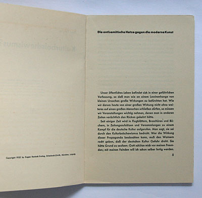
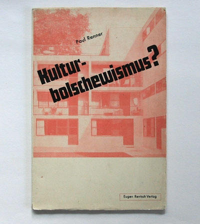
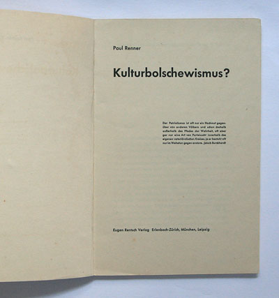
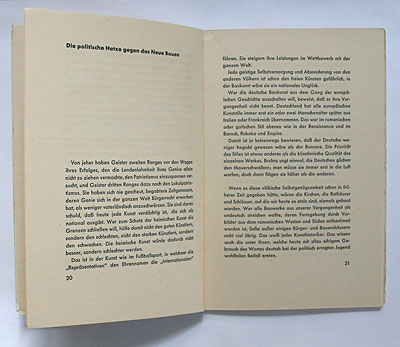
the rare 1932 original edition is a nice example of "new typography", set entirely in futura. no designer is credited, however i guess the typography is by renner himself. the cover (pictured above) shows a red tinted photo of a flat-roofed "new architecture" apartment block – the house for single women "zum neuen singer" in basel, switzerland, built by paul artaria and hans schmidt in 1929 (same photo reproduced in the exhibition catalogue "dreissiger jahre schweiz – ein jahrzehnt im widerspruch", kunsthaus zürich, 1981, p. 135). this symbol of modernism is diagonally slashed by the title set in renner's then new futura schlagzeile typeface, ironically mocking russian avant-garde typography. the red box around the publisher's name is somewhat reminiscent of jan tschichold's similar designs of that time. as you will see in one of my next book (design) stories.
series to be continued – updated weekly!
--------------------------------------
book (design) stories home
index of published book (design) stories
