
book (design) story #127
(unknown) :
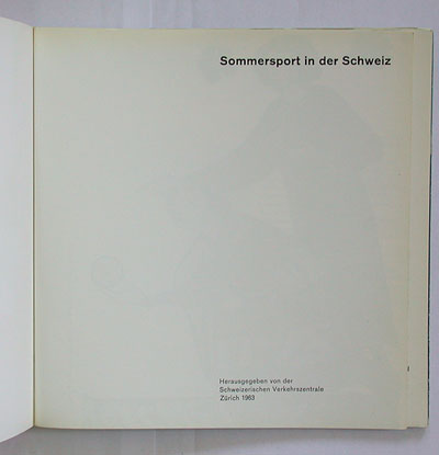
sommersport in der schweiz
schweizerische verkehrszentrale, zürich, 1963
size: 18 x 18 cm
designer: hans hartmann
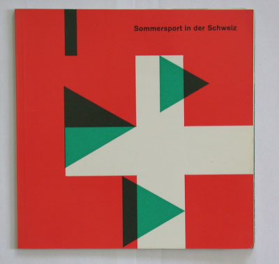
this brochure published by the swiss tourist office was aimed at sporty visitors, claiming that the swiss have always been a nation of sport lovers... it was edited by sports journalist karl erb and designed by hans hartmann (1913-1991), a bern-based graphic designer who created the logo of sbb, the swiss railway company, and many swiss stamps. the cover of this 1963 brochure sports the ubiquitous akzidenz-grotesk, and a sort of "constructive art" design with green triangles around a swiss flag – i have actually no clue what these triangles mean.
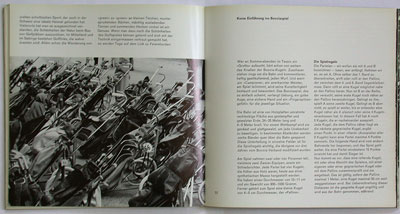
inside sans-serif , set unjustified in two columns, and bled-off photos. The booklet features traditional swiss sports such as "hornussen" (hornet), a cricket/baseball-type game: where fielders have to catch a ball (the buzzing "hornet") using wooden paddles which are thrown up in the air. the bowler uses a flexible steel rod to hit the "hornet" – see picture below. funny detail: the position of the ball is marked by a dot on the facing text page.
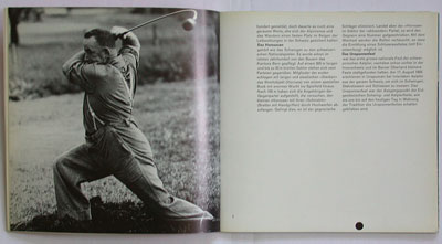
there is also a chapter about golf, brought to switzerland by britons.
--------------------------------------
book (design) stories home
index of published book (design) stories