
book (design) story #128
p. m. handover:
geschichtliches über die endstrichlose schrift
monotype corporation limited, bern, 1961
size: 21 x 15 cm
designer: (unknown)
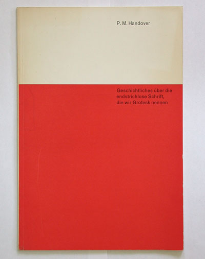
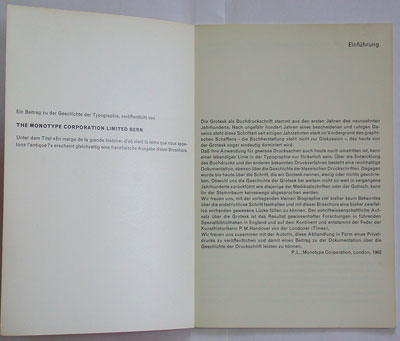
this "history of the serifless type we call grotesque" by phyllis margaret handover was privately printed by the swiss monotype subsidiary in 1962. the design is quite "swiss" – with its red square area on white it reminds me of book 78.
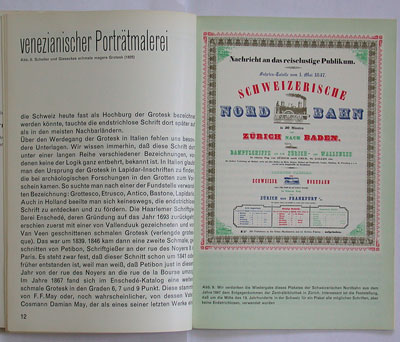
the booklet shows many early examples of 19th-century grotesques. below a reproduction of a swiss railway poster from 1847 featuring a mix many different typefaces – but no sans-serif!
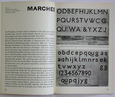
on page 32 ms. handover foresees a bright future for adrian frutiger's univers: designed by a swiss who has been living abroad for almost ten years and therefore has aquired a healthy distance to certain extreme tendencies in swiss typography.
however, the booklet is set in monotype grotesque 215. On page 35 we read: in the last ten years this typeface has become increasingly popular on the continent, and recently also in britain. some time ago some characters have been redesigned upon requests by some swiss graphic designers.
--------------------------------------
book (design) stories home
index of published book (design) stories