
book (design) story #163
arthur goldstein:
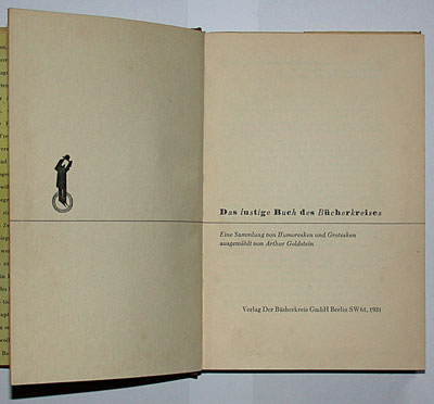
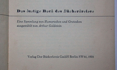
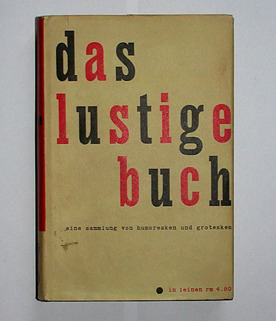
das lustige buch
verlag der bücherkreis gmbh, berlin, 1931
printer: vorwärts buchdruckerei, berlin
size: 19 x 13 cm
designer: jan tschichold
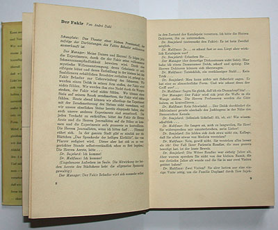
in 1929 the bücherkreis book club first published "das lustige buch" (the funny book), a collection of "humoresque and grotesque" stories, edited by arthur goldstein. two years later this second edition followed. among the contributors are bücherkreis authors felix scherret, erich grisar (see book 41), oskar wöhrle, etc. but also more familiar names such as erich kästner, mark twain, and "peter panter" (i.e. kurt tucholsky). there is also a writer with the hilarious name "hilarius berg", probably a pseudonym.
paul renner stated in his 1930 book "mechanisierte grafik" (see book story 43, page 21): "eine druckerei ist keine masken-verleihanstalt" (a printshop is not a fancy-dress hire). in his opinion, typography should be no masquerade ("kein maskenfest"). well, i dont' know if meisterschule director renner really approved of this title design by one of his teachers, jan tschichold (1902-1974).
funny typography for the funny book: a "dance" of alternating bodoni ultra-bold and didot italic letters on the title page, ...
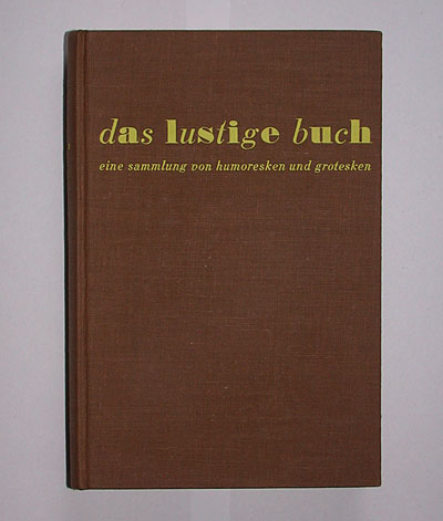
... a clownery which is repeated on the cover – with changed "masks": each letter now "wears" the other typeface, and no uppercase ...
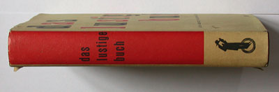
on the yellow dustjacket, the title comes in only one (narrow slab-serif) typeface, but now the red and black colours alternate. the smaller text is set in a monospaced typeface, imitating a typewriter.
--------------------------------------
book (design) stories home
index of published book (design) stories