
book (design) story #18
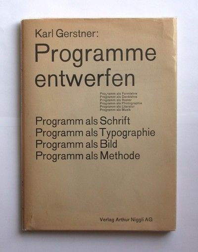
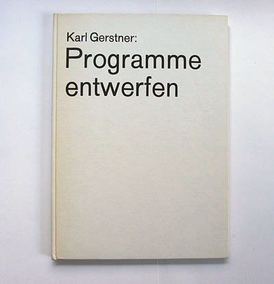
karl gerstner:
programme entwerfen
verlag arthur niggli, teufen, 1963
printer: brin + tanner ag, basel
size: 25 x 17 cm
designer: karl gerstner
the last karl gerstner (1930-2017) for a while, i promise. this book is very interesting because its "programming" approach shows an early affinity to the then quite novel information technology. in four essays gerstner explains his systematic methodology for graphic design and art. the foreword is by paul gredinger – the other letter "g" in the name of the famous advertising agency ggk he formed with "g"erstner and markus "k"utter in 1962.
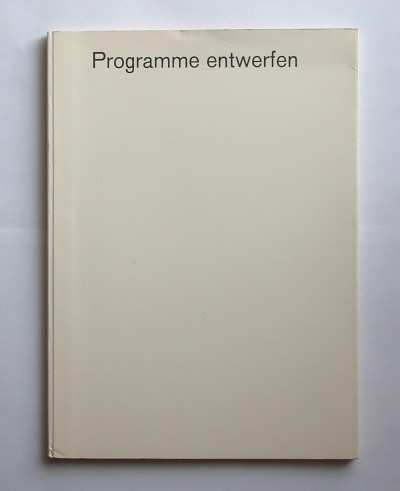
the dust jacket features akzidenz-grotesk in a variety of sizes – sort of announcing the hommage to this typeface in one of the essays. under the jacket there are again plain, card wrappers with a cloth spine.
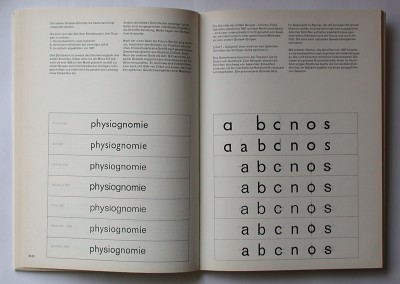
in his akzidenz-grotesk essay gerstner discusses the qualities of different sans-serifs. interestingly, he is not too fond of the newer typefaces such as helvetica (by max miedinger) or univers (by adrian frutiger). he considers them "too smooth". for gerstner the good old "no-designer" akzidenz-grotesk is still the best sans-serif – he appreciates the "fresh liveliness" of its unrefined shapes, and its alleged immunity to short-lived fashions. finally gerstner presents his project of a slightly redesigned and extended akzidenz-grotesk family for the diatype photosetting machine.
a second, extended edition was published in 1967. with identical jacket but with green writing, ...
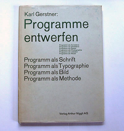
... and a cloth cover.
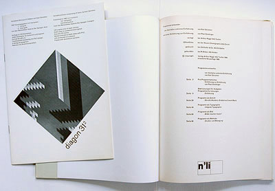
like in the first issue the impressum states that the book was "optisch organisiert" (optically organised) by gerstner – a tschicholdian expression he had already used in this book. the second edition came with a brochure about gerstner's multiple "diagon 312" laid in.
--------------------------------------
book (design) stories home
index of published book (design) stories