
book (design) story #233
walter dexel, willy rotzler:
glas aus vier jahrtausenden
kunstgewerbemuseum zürich (wegleitung 212), 1956
printer: käser presse, zürich
size: 21 x 15 cm
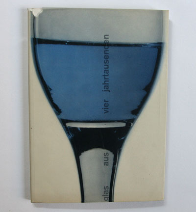
photographer: manfred bingler (cover)
designer: carl b. graf
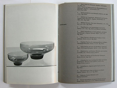
the kunstgewerbeschule (school for applied arts) in zürich was a place were young graphic designers learned the "swiss style" in the 1950s. the exhibition catalogues and posters of the kunstgewerbemuseum (museum for applied arts) which is under the same roof are often excellent examples of this style. here a catalogue of an exhibition on the history of glass. you find a picture of the similar poster on the poster collection website of the swiss national library.
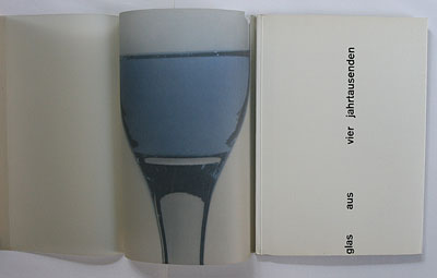
the photo of a glass is printed on a glassine dustjacket while the title is printed vertically on the white wrappers – shining through the semi-transparent jacket like through glass! printed glassine jackets were quite popular in the 1940-50s (see stories 25, 26).
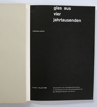
the catalogue design by carl bernhard graf (1926-1968) is a clasic example of 1950s' swiss modernism: asymmetric page layout and page numbers, sans-serif typeface, lowercase titles reveal the influence of 1920s' new typography.
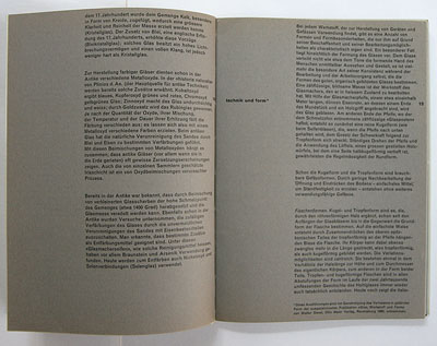
the flush-left ragged-right setting of type and dark, rough paper for text pages are a style often used by max bill (see stories 177, 154).
--------------------------------------
book (design) stories home
index of published book (design) stories