
book (design) story #28
colin ross:
das fahrten- und abenteuerbuch
büchergilde gutenberg, leipzig, 1925
printer: buchdruckwerstätte g.m.b.h., leipzig
size: 24 x 17 cm
designer: jan tschichold
in 1925 the german printer's trade union magazine "typographische mitteilungen" published a special issue that turned out to be a manifesto of "new typography". it was edited by a young professional typographer and calligraphist with the birth name of johannes tzschichhold – but in this magazine he appears under a slightly changed name: iwan tschichold (1902-1974). after he had seen works by russian avant-garde artists at a bauhaus exhibition tschichold adopted not only a russian-inpired graphic design style but a russian first name, name.
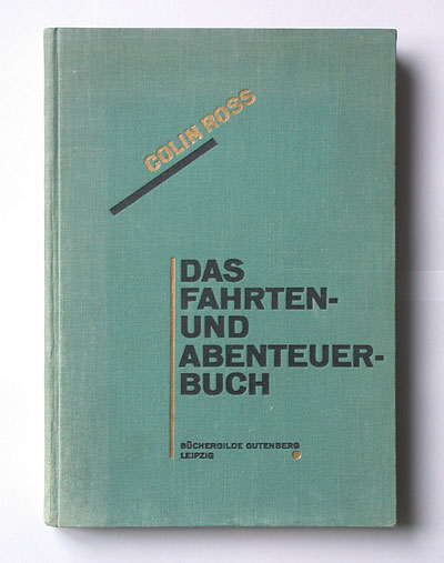
in that same year, "iwan" tschichold also designed his first book for the büchergilde gutenberg that had been founded by the same printer's union in leipzig. the green cover with its dynamic diagonal design constructed only with typographical material – letters, lines, dots – is obviously influenced by works such as el lissitzky's famous book of mayakovsky poems, "dlya golosa", from 1923.
but interestingly, tschichold doesn't use the "revolutionary" colour red that is omnipresent in russian avant-garde works, but a rather precious looking gold. and when you open the book you are dazzled by the shine of golden endpapers!
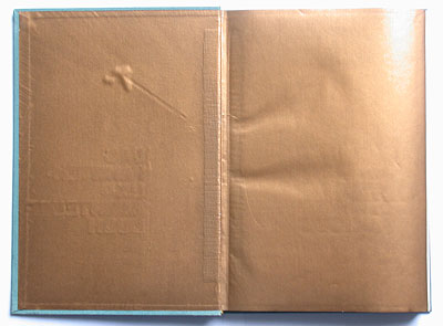
gold may not be the colour of the revolution, but it is nevertheless very russian. gold plays an important role in the older russian culture, for example in religious icons. and from this background it found its way into the work of another influential russian avant-garde artist: abstract painter wassily kandinsky, who was a professor at the bauhaus in the 1920s. in this respect my visit to the bauhaus buildings in dessau was an eye-opener: go and see the beautiful bauhaus meisterhäuser (master's houses) with their recently restored interior colours. in kandinsky's living room you will find a wall, gold coloured from ceiling to floor – it reminded me of iwan tschichold's endpapers for this book. and in a vitrine there was the original folder for a kandinsky print portfolio on display – it is entirely golden, too.
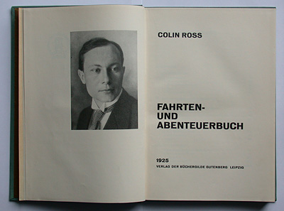
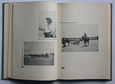
the inside of this büchergilde book is pure early "new" or "elemental typography": asymmetrically arranged titles and bold, oversized page numbers, all in sans-serif. photos and captions are placed to form a rhythmic visual pattern as in a constructivist painting.
the ambivalent mix of progressive (constructivist) and conservative (gold) design features kind of fits this book by an author who was a rather controversial character. colin ross (1885-1945), a german of scottish decent, writes about his life as a travelling adventurer and explorer – from working in coal mines to fighting on ww1 battle fields to travelling around the world. there is a photo showing him as a fighter for the mexican revolution – complete with hat and gun in his belt (below, top left).
.
colin ross was obviously a man who adapted his life to all sort of changes – also to the new zeitgeist in post-1933 germany. in april 1945, with "iwan" ante portas, colin ross took his and his wife's life with a gun.
--------------------------------------
book (design) stories home
index of published book (design) stories