
book (design) story #29
jan tschichold:
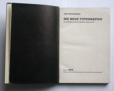
die neue typographie
bildungsverband der deutschen buchdrucker, berlin, 1928
printer: buchdruckwerkstätte gmbh, berlin
size: 21 x 15 cm
designer: jan tschichold
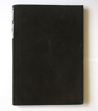
this plain black cloth cover belongs to one of the most important typography books of the 20th century. after his manifesto "elementare typographie" (elemental typography) had been published as a special issue of the trade union's magazine "typographische mitteilungen" in 1925, jan tschichold (1902-1974) wrote this comprehensive book that adressed ideological and practical issues of the "new typography" movement.
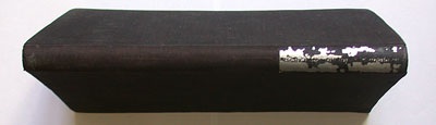
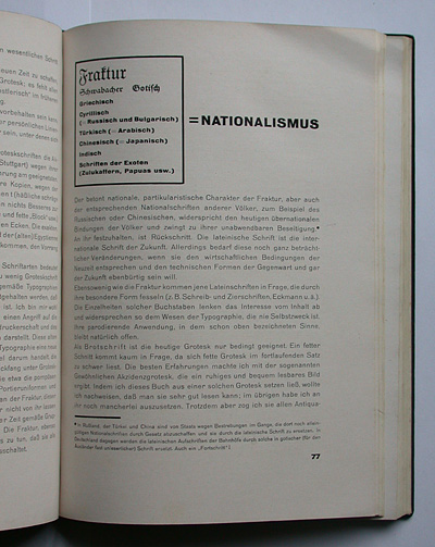
tschichold designed the book in a very straightforward way: sans-serif type, black cloth cover with a silver-coloured spine title (often rubbed off, but still partly there on this copy). the black cover and frontis seem to underline that this book is about "die schwarze kunst", the black art of printing. bold page numbers, fat lines, and footnotes marked by bullet points are typical for early "new typography" designs.
this book is much more ideologically charged than tschichold's later publications. his enthusiasm for sans-serif (and roman, to a certain degree) goes as far as to denounce all other typefaces and alphabets as "nationalism"– not only blackletter, but also "greek, cyrillic (=russian and bulgarian), turkish (=arabic), chinese (=japanese), indian and other exotic scripts (zulus, papuas, etc.)"! soon tschichold would revise this extremely euro-centric position and endorse a "good mix" of typefaces, and he actually turned into a great admirer of far eastern printing culture.
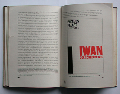
in 1926 paul renner invited tschichold to teach at the meisterschule für deutschlands buchdrucker (masters school for germany's printers) renner summoned him to change his adopted russian first name, for he "could not present the inhabitants of munich with an iwan", as he recalled later. tschichold accepted and called himself "jan". funnily, one of tschichold's poster designs for a munich cinema is reproduced in the book – it reads "iwan der schreckliche" (ivan the terrible) in bold red letters.
--------------------------------------
book (design) stories home
index of published book (design) stories