
book (design) story #30
jan tschichold:
typographische gestaltung
benno schwabe & co., basel, 1935
printer: benno schwabe & co., basel
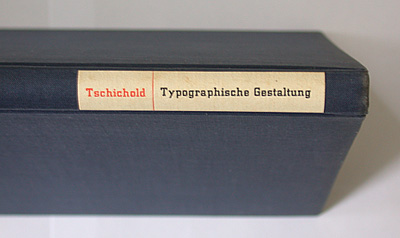
size: 21 x 15 cm
designer: jan tschichold
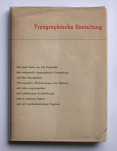
jan tschichold (1902-1974) wrote the book "typographische gestaltung" two years after he had left germany to live in basel, switzerland. it was published by schwabe, a printing company he worked for. this book promotes an asymmetric style of typography, but tschichold no longer sticks to the strict sans-serif ideology of "die neue typography" (see story 29).
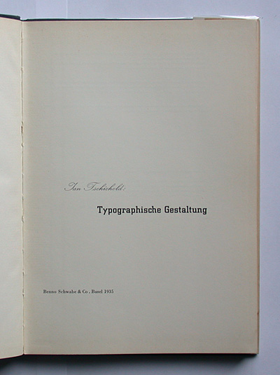
the book – and its design – is a manifestation of tschichold's new approach of a "good mix" of typefaces. the title page, with an elegant, traditional script for the author's name and a blocky slab-serif (city) for the title, is a classic.
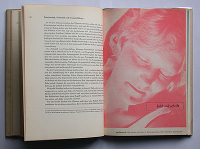
there are some nice design examples printed on different papers. i especially like this light red photograph with boxed futura title – somewhat similar in style to the book of my first story.
--------------------------------------
book (design) stories home
index of published book (design) stories