book (design) story #31
jan tschichold:
asymmetric typography
faber and faber limited, london / cooper & beatty, toronto, 1967
printer: t. h. best printing company limited
size: 24 x 15 cm
designer: jan tschichold

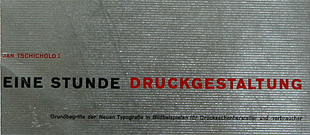
this english translation of jan tschichold's (1902-1974) influential book "typographische gestaltung" (see story 30) was published 32 years after the german first edition – at a time when tschichold had long developed a neo-traditional style.

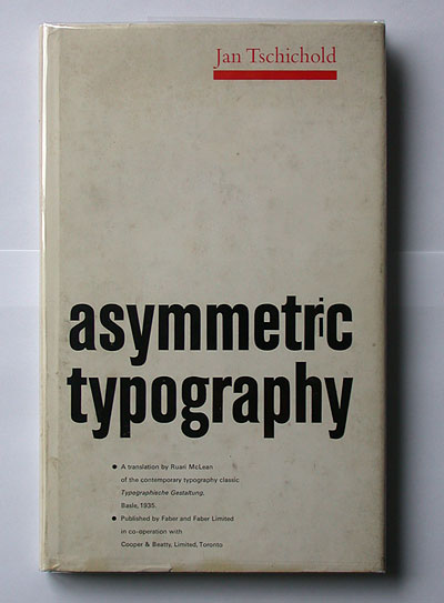
tschchold proves that he can still do a nice asymmetric book design. the dustjacket with a fat red line and lower-case title are reminiscent of tschichold's "elemental typography" times. the shrunk "i" in "asymmetr(i)c" looks like a twinkle in the eye...

--------------------------------------
book (design) stories home
index of published book (design) stories
