
book (design) story #396
(unknown) :
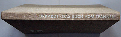
das buch vom spannen
paul forkardt kommanditgesellschaft, düsseldorf, 1939
printer: industriedruck ag., essen
size: 30 x 22 cm
designer: max burchartz
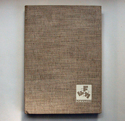
in 1923 paul forckardt fonded the company based in düsseldorf which became a leading supplier of workholding equipment. it still exists today.
the company logo with three "f" letters symbolising chuck grips is also still used to this day.
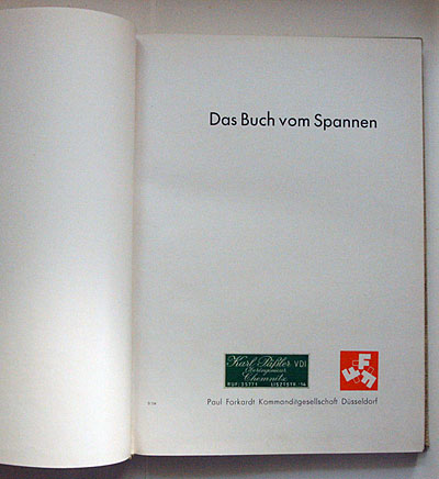
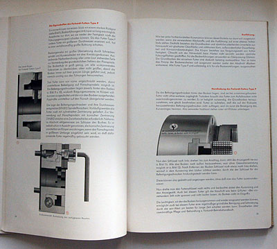
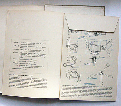
"the book on chucking" is a beautiful example of modernist book design, set in futura with an asymmetric page layout. on the title page next to the company logo the exlibris of a chemnitz chief engineer.
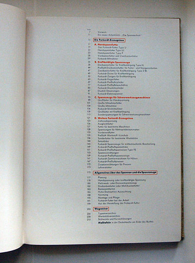
note the boxed titles and circles around illustration numbers in orange.
you may be surprised that such a purely "new typography" book was published in 1939 germany, when the notorious "schaftstiefelgrotesk" (jackboot grotesque blackletter) was the typographical expression of the zeitgeist. however the nazis tolerated modernist design and architecture in certain contexts, especially industrial.
the book was designed by modernist graphic design pioneer max burchartz (1897-1961). after 1933 burchartz proved compatible with the new regime and joined the nsdap. he continued working as a graphic designer and book author (see story 353).
--------------------------------------
book (design) stories home
index of published book (design) stories