
book (design) story #43
paul renner:
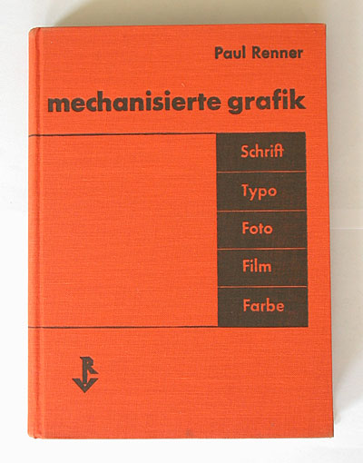
mechanisierte grafik
verlag hermann reckendorf g.m.b.h., berlin, 1930
size: 21 x 15 cm
designer: paul renner
paul renner (1878-1956) published his book "mechanisierte grafik" (mechanised graphics) when he was director of the meisterschule für deutschlands buchdrucker (master school for germany's printers) in munich. the book discusses the impact of modern technology – which was mainly mechanic, not electronic yet – on visual design. renner not only looks at typeface and graphic design but includes aspects of photo, film and colour.
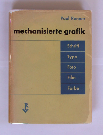
the jacket and cover share the same design in different colours. modernity is expressed not only by a sans-serif typeface – renner's futura – but also by dropping the uppercase in the title and using "f" instead of "ph" in "grafik" and "foto".
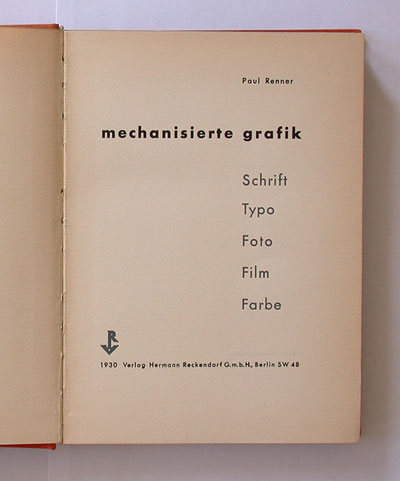
the title page echoes the cover design, but in a different cut of futura: the curl of the "r" is a detached dot.
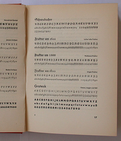
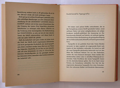
renner looks at the history of typefaces, and he is convinced that every age has to find the typography that best suits its needs. he points out parallels to modern architecture: the "carneval" of pseudo-historistic styles should give way to a new clarity and beauty – e.g. his futura typeface (used throughout the book).
but renner warns of any new orthodoxy, ideological dogmas and irrational formalism. in his chapter about "functional typography" renner is rather critical about the early "elemental" typography with its huge circles, bars and squares – in his eyes more a "fashion success" than real progress.
renner quotes from a booklet issued by the sozialistische arbeiterjugend (socialist youth organisation) propagating non-objective painting (translated from page 105):
there it says: "for centuries, the colours had to serve other masters – the objects... the colours were exploited by a higher class, the objects. figurative painting follows the principles of class society: colours have to work hard in order to represent objects". (we expect the outcry: coulours of all countries, unite!)
i agree, leftist ideological nonsense indeed! renner doesn't mention the author of this text, but i found out that he actually quotes from the book of story 500. and renner was equally critical about rightist nonsense, as his booklet "kulturbolschewismus" (story 1) proves.
interesting is renner's critcism of piet mondrian's ideology of "pure means" in art – he finds such puritanical spirituality rather frightening. he prefers kurt schwitters who doesn't have this dry preacher's tone (page 108) and paul klee's mix of humour, irony and deeper meaning.
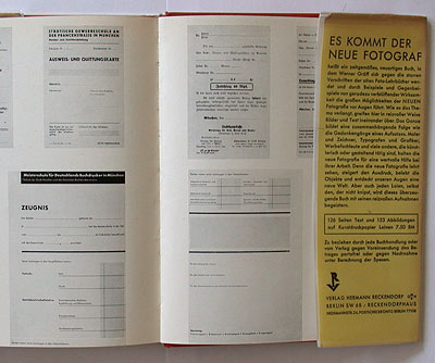
the photo section, printed on coated paper, includes some before-and-after examples of typographical designs, and fine photos by aenne biermann. the back flap of the dustjacket advertises another important book publihed by hermann reckendorf: werner gräff's "es kommt der neue fotograf".
"mechanisierte grafik" was among the winners of the german annual 50 most beautiful books award.
--------------------------------------
book (design) stories home
index of published book (design) stories