
book (design) story #48
rudolf daumann:
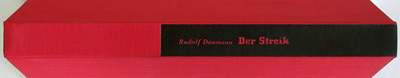
der streik
büchergilde gutenberg, berlin, 1932
printer: buchdruckwerkstätte berlin g.m.b.h.
size: 24 x 17 cm
designer: philipp albinus
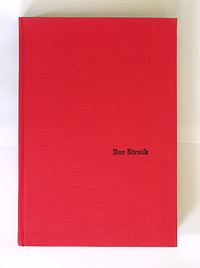
which colour would you choose for the cover of a book with the title "der streik" (the strike)? rudolf heinrich daumann (1896-1957) based this novel on historic events, the miners' strike in the silesian town of waldenburg (today: walbrzych) in 1869/70. the german dialogues are full of local dialect. rudolf daumann kept publishing novels in germany after 1933, however in a slightly different vein. i read somewhere that he was involved in the resistance movement against hitler.
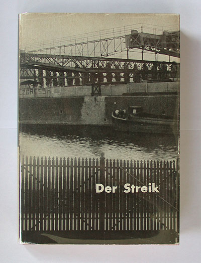
the dustjacket shows a photo from an industrial complex, with "der streik" typed in bold futura across a closed gate.
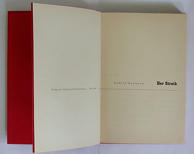
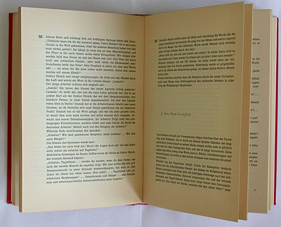
the typography relies on city, a square slab-serif typeface very popular in those years (see stories 11, 29, 47). city is used for the titles and the asymmetrically placed page numbers. the end papers are bright red, too.
the typographic designer is credited in the impressum: ph. albinus, frankfurt a. m. – more about him in the next story.
--------------------------------------
book (design) stories home
index of published book (design) stories