
book (design) story #49
philipp albinus:
grundsätzliches zur neuen typographie
bildungsverband der deutschen buchdrucker, berlin, 1929
printer: buchdruckwerkstätte g.m.b.h., berlin
size: 20 x 15 cm
designer: philipp albinus
one year after jan tschichold's groundbreaking "die neue typographie", the typographers' union published this small book. the author is philipp albinus who later designed daumann's "streik" (story 48) for the büchergilde gutenberg, a book club associated with the union and printed at their workshop. the endpapers in both books are of the same bright red colour.
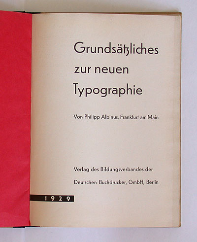
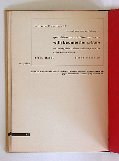
sans-serif type and asymmetric page layout is what you would expect in a book about "new typography". but the ranged-right setting of text is rather unusual, and somewhat similar to the book in story 46.
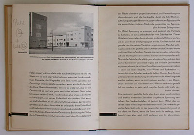
while tschichold's 1928 book pointed out some parallels between new typography and modern art, albinus compares graphic design with architecture.
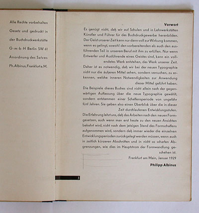
although his text is mixed-case, albinus claims that all-lowercase setting should not be considered less "orthographically correct" than the common all-uppercase for titles, etc. in his opinion lowercase is more dynamic and often easier to read than uppercase with its static, slowing-down nature.
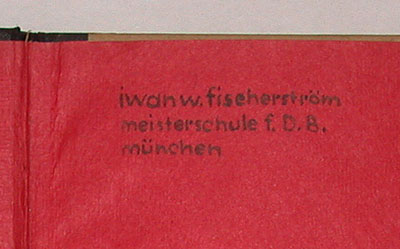
there is a hand-inked inscription – asymmetrically arranged, as one would expect: iwan w. fischerström / meisterschule f. d. b. / münchen // königinstrasse 47a. fischerström was a swedish graphic designer (see story 44).
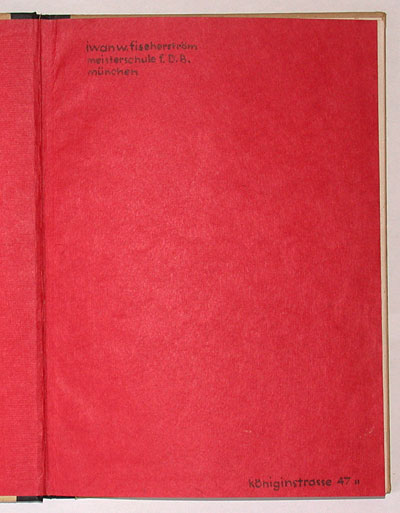
the handwriting emulates meisterschule director paul renner's futura typeface – complete with stick-and-ball "r"!
--------------------------------------
book (design) stories home
index of published book (design) stories