
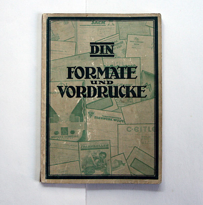
book (design) story #574
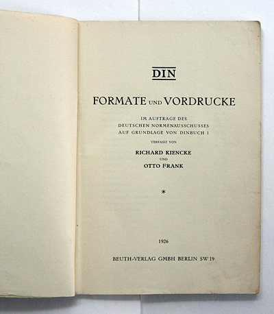
richard kiencke, otto frank:
din – formate und vordrucke
beuth-verlag gmbh, berlin, 1926
size: 21 x 15 cm
designer: (unknown)
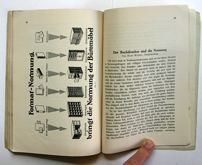
standardisation was a big buzzword among modernist designers and architects of the 1920s (and later).
in germany the "din norm" was propagated for paper formats and book sizes, ...
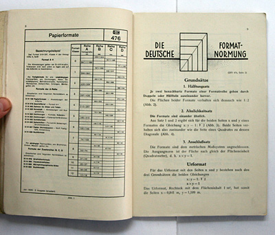
... and used for many modernist publications (also by tschichold who later declared the din sizes unsuitable for books).
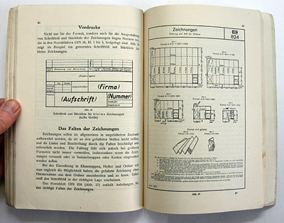
the examples of normed stationary below are not yet in the new typography style, ...
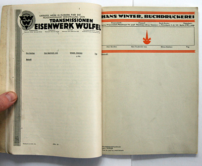
... however it is obvious that the normed sansserif and table styles used in technical drawings had an influence on modernist graphic design.
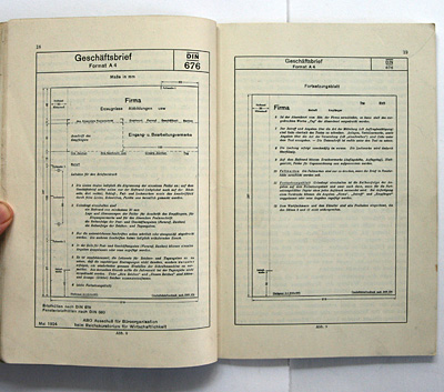
according to the authors one advantage of din book formats ...
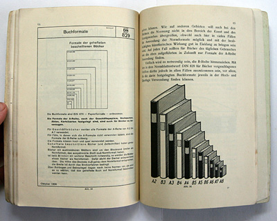
... is the economic packaging of different sizes in one box.
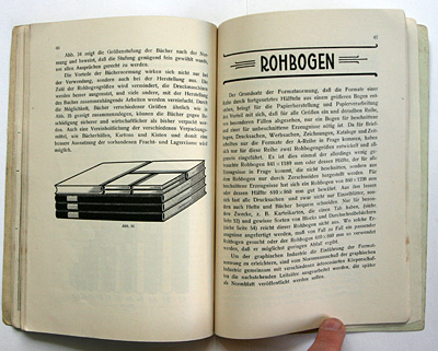
standardised paper also meant standardised office furniture.
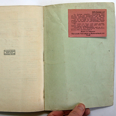
the red sticker is an ad for a screw manufacturer who claims to support and promote din standardisation in their business practise.
--------------------------------------
book (design) stories home
index of published book (design) stories