
book (design) story #6
helmut wickel:
i.-g. deutschland
verlag der bücherkreis, berlin, 1932
printer: auerdruck, hamburg
size: 23 x 15 cm
designer: jan tschichold
in the 1920s, several socialist book clubs were founded in germany – "büchergilde gutenberg", "universum bücherei" and "der bücherkreis" being the most successful. their goal was to educate the working classes by producing affordable books with appropriate, politically correct content. while many of these books and authors are more or less forgotten, some are considered classics today.
the book shown is from the berlin-based bücherkreis. around 1930, this book club had a very modern marketing idea: they commissioned one of the leading exponents of modern typography, jan tschichold (1902-1974) to redesign their publications. and tschichold did a great job: from 1931 on all the organisation's books and other printed matters such as magazines, brochures, ads and stationary had a consistent new look – a "corporate design" in modern terms.
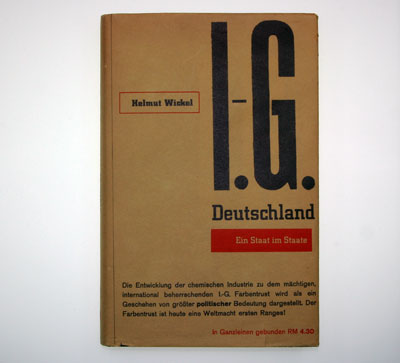
"i.-g. deutschland" is a critical report about the powerful german chemical trust, interessengemeinschaft farbenindustrie ag, or i.g. farben for short. the book warns about the political danger of this company - rightly, as we know today. many historians say that the trust's support was crucial for hitler and his war plans. later, i.g. farben operated a subsidiary named "i.g. auschwitz". if you want to know more about this infamous company there is plenty of info on the net.
let's look at jan tschichold's book design: the dust jacket serves as a flashy little poster, in black and red on a yellow ground, using typographical material only. the huge letters visualise the industrial giant's power – they seem to crush the much smaller "deutschland" beneath. at the bottom we read about the content of the book and its price – "objective" information in a plain sans-serif type.
the jacket design demonstrates the asymmetric balance of text blocks and the contrast between printed and blank areas that tschichold was so fond of at the time. the "proper" mixing of different type such as slab-serif, sans-serif etc. is a favourite subject of tschichold's in his books and articles of the 1930s.
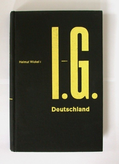
the cover of the book is a variation of the jacket's design. the waspy yellow on a deep black cloth combined with a sky-blue coloured top edge make for a spectacular effect.
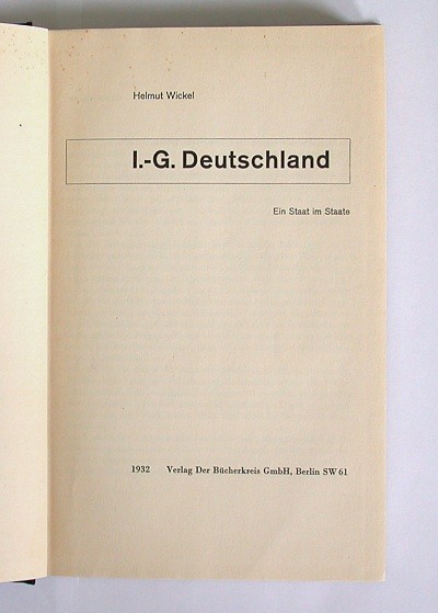
the title page is done in a classic asymmetric style, too. the boxed title – echoing the box around the author's name on the dust jacket – is a detail often seen in tschichold's designs of that time. however, the bold effects of the jacket and cover are avoided inside the book. the page numbers, although still asymmetrically arranged, have become small and light.
in 1933 the bücherkreis was shut down by the nazis. the author of "i.-g. deutschland", helmut wickel (1903-1970) ended up in a concentration camp but managed to flee in 1934, first to czekoslovakia, then to france, finally to the usa. after the war wickel returned to germany, working for an organisation that ironically was also called "i.g." – the "industrie-gewerkschaft chemie", the union of workers in the chemical industry.
--------------------------------------
book (design) stories home
index of published book (design) stories