
book (design) story #7
michael scholochow:
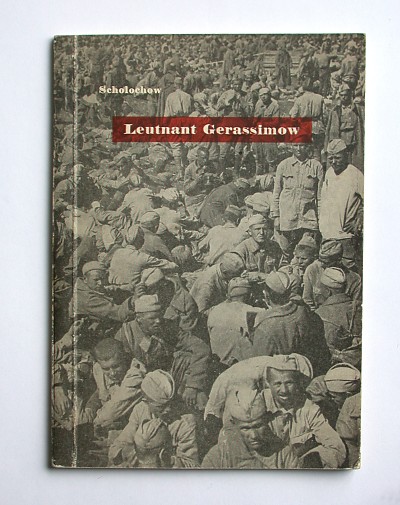
leutnant gerassimow
verlag gesellschaft schweiz-sowjetunion, zürich, 1944
size: 21 x 15 cm
designer: richard paul lohse
this undated brochure was published in switzerland during the second world war. it contains a short story by an author who would have been 100 this year. mikhail aleksandrovich sholokhov (1905-1984), a russian writer with cosack background, is renowned for his novel "quiet flows the don" that won him the nobel prize for literature in 1965.
however, sholokhov represents one of the most disputed of all nobel prize winners. he was a loyal member of the communist party and close to stalin. there have been claims that sholokhov is not the true author of the "don", fueled by the impression that his later books do not quite reach the quality of his early masterpiece. then again, some long-lost manuscripts that have surfaced since do appear to confirm his authorship.
the title of the slim booklet is "leutnant gerassimow" (lieutenant gerasimov). it is the first german edition of sholokhov's short story "nauka nenavisti" (science of hate) that was published in the "prawda" of 22 july 1942. the story is about a red army lieutenant who explains his deep hatred against the germans by the cruelty he experienced as their prisoner of war.
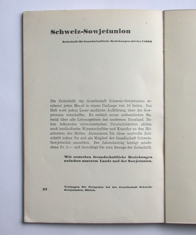
this german version of a rather propagandist piece of russian literature was published by the "gesellschaft schweiz-sowjetunion". this organisation aimed "to achieve amicable relations between our country and the soviet union", as an ad on the last page explains. it's interesting that this organisation obviously preferred a less aggressive title for the german edition of comrade sholokhov's "hate" piece.
although the designer of the book's cover and typography is not named, we know today that it is by richard paul lohse (1902-1988). according to the catalogue of his graphic design work (isbn 3775709916) lohse also designed the organisation's stationary and some other publications. the photographic cover shows a mass of unarmed red army soldiers sitting around, apparently prisoners of war. a nice little detail is the white title in bold antiqua type with a transparent red block around it. the aymmetric title layout and bold page numbers reveal a "new typography" influence.
the objective, "democratic" style of this cover reflects lohse's design principles that are also present in his painting. it is the opposite of the rather crude monumental symbolism usually seen in "socialist realism" propaganda artwork. the design is as toned down as is the german story title.
--------------------------------------
book (design) stories home
index of published book (design) stories