
book (design) story #15
lucius burckhardt, markus kutter:
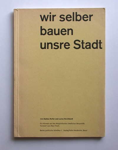
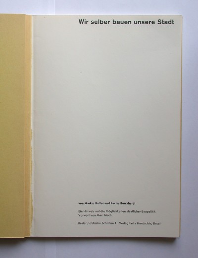
wir selber bauen unsere stadt
verlag felix handschin, basel / basler politische schriften 1, 1953
printer: buchdruckerei zum basler berichthaus ag, basel
size: 21 x 15 cm
designer: karl gerstner
after talking about "achtung: die schweiz" (see story 5) and "die neue stadt" (story 14) i probably should present the first booklet of this trilogy, too. in the foreword signed "max frisch, dipl. architekt, s.i.a. zürich", the famous swiss writer urges that switzerland needs a visionary urban planning which will only happen if the politicial forces are willing to adress this issue. as the title suggests, the authors demand that the people themselves should take an active part in this process.
like the other two, this first booklet was designed by karl gerstner (1930-2017). they all share "swiss new new typography" features such as a page layout that is asymmetric to the spine and sans-serif type. typical gerstner-isms such as the lower-case beginnings of titles and unjustified setting are already present, but in this early example he does not experiment with paragraph widths yet.
the title on the yellow cover is set in semi-bold akzidenz-grotesk, the trademark typeface of modern swiss typography at that time. a funny detail: while the inner title actually says "unsere Stadt", the cover title shortens the pronoun to "unsre". why? to make the line fit in the large 60 pt size.
--------------------------------------
book (design) stories home
index of published book (design) stories