
book (design) story #23
h. g. wells:
der heilige terror
büchergilde gutenberg, zürich, 1940
printer: genossenschaftsdruckerei zürich
size: 24 x 17 cm
designer: richard paul lohse
english writer herbert george – usually shortened to hg – wells (1866-1946) is best known for his early sci-fi novels "the war of the worlds" and "the time machine". in his last novel, "the holy terror", wells profiles the psychological development of a modern dictator modeled after stalin, mussolini and hitler. the büchergilde zürich published this german translation shortly after the english first edition came out.
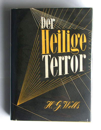
the book's flashy design plays with strong contrasts in colour and type. the dustjacket sports huge, bold-narrow didone letters that seem to be projected into the black by beams of yellow and white lines. the script used for the author's name also features contrasting strokes.
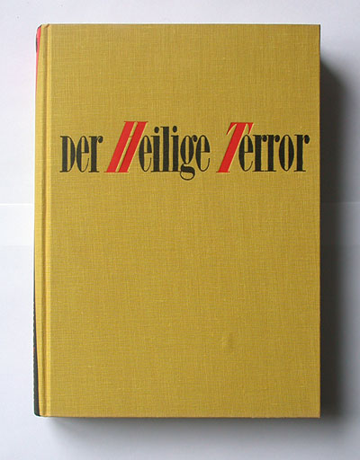
the title on the bright yellow cloth cover is set in the same bold-narrow didone typeface. Most unusual are the slanted capital "h" and "t" letters in red: both seem to rest their weight on the following letter "e" – while the unslanted capital "d" is like a small cap, only the size of the lowercase's x-height.
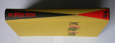
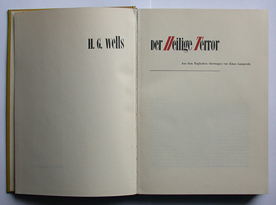
these odd letters also appear on the spine, combined with red and black wedge shapes, and on the title page – here in a modern, asymmetric layout across the double-page spread.
no designer is credited in the impressum, but the dustjacket is signed "lohse" in script. it is the same signature that can be seen on other works by swiss painter and graphic designer richard paul lohse (1902-1988). lohse's paintings of the early 1940s often show triangular shaped geometric line constructions in black, yellow and red.
--------------------------------------
book (design) stories home
index of published book (design) stories