
book (design) story #441
peter smolensky:
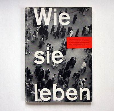
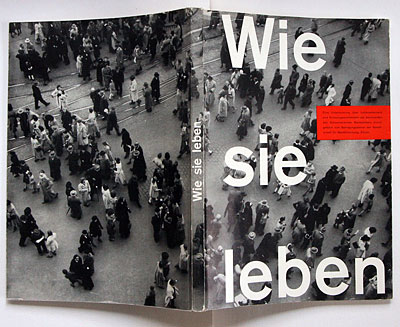
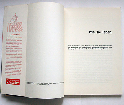
wie sie leben
gesellschaft für marktforschung, zürich, 1951
size: 21 x 15 cm
photographer: paul senn
designer: fritz meyer-brülhart
i was pointed to this classic example of early 1950s swiss typography by photobibliothek.ch, a highly recommended site of an incredible private collection of photo books.
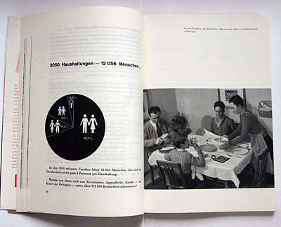
"how they live" is a survey on the living situation of the swiss in 1951, conducted by a market research company for the popular swiss periodical "beobachter" (=observer).
the photographic cover sports a huge asymmetric title in semibold akzidenz-grotesk.
the impressum names paul senn (1901-1953) as the main photographer, ...
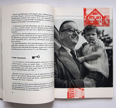
... and credits fritz meyer for the typography. i guess this must be fritz meyer-brülhart (*1917), a zürich-based graphic designer also listed in book 326. note the overprinting of photos in two colours, a popular modernist design style.
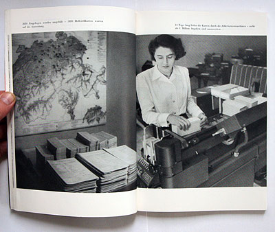
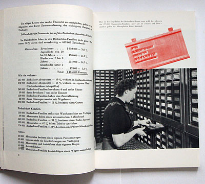
the book proudly explains out that hollerith punch cards were used to process survey data.
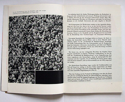
an interesting visualisation of "90%" using a grid and photo.
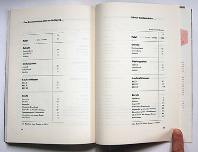
there is class-related data about the use of household machines in switzerland, like ...
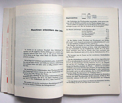
... e.g. 71% of entrepreneurs, but only 2% of workers or farmers, owned a refrigerator in 1951!
--------------------------------------
book (design) stories home
index of published book (design) stories