book (design) story #83
markus kutter:
geigy 1758-1939 / geigy heute 1958
birkhäuser ag , basel, 1958
printer: karl werner ag , basel / birkhäuser ag, basel
size: 25 x 23 cm
designer: karl gerstner

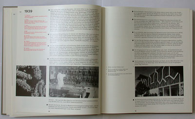
in basel, swiss typography is closely linked to the local chemical industries. in 1958 the geigy company (today: novartis) celebrated its 200-year anniversary with a two-volume publication designed by karl gerstner (1930-2017) and (partly) written by markus kutter (1925-2005) – a "dream team" that later founded ggk, a successful advertising agency.

karl gerstner used his trademark square format with brownish card wrappers and a white spine – very similar to the books in stories 16 and 37). each volume has its own slipcase.

akzidenz-grotesk type, ...

... asymmetric page layout, ...

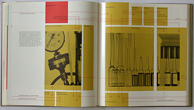
... grid-based image placement ...

... – classic swiss typography!

typical for gerstner's style: some titles begin with lower-case, texts are set flush left, ragged right, ...

... and some sections have pages in different colours.

--------------------------------------
book (design) stories home
index of published book (design) stories
