book (design) story #720
(unknown) :
st. moritz
kurverein st. moritz, around 1940
printer: art. instuitut orell füssli ag, zürich
size: 21 x 10 cm
photographer: albert steiner, et al.
designer: werner weiskönig
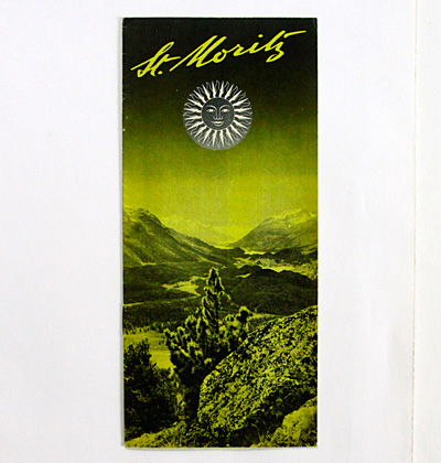
here a true highlight: a tourist brochure for the swiss mountain resort of st. moritz (with texts in english language). since the early 1930s, st. moritz had a notably modern approach regarding its visual promotion, see e.g. stories 460 and 587. the legendary team of amstutz & herdeg was instrumental in establishing the "st. moritz" branding with the script logotype and "smiling sun face" logo still in use today.
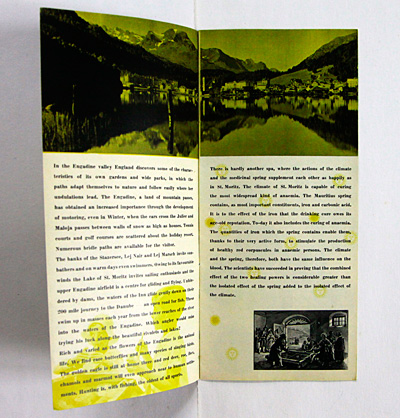
this undated pamphlet relies on that branding, however it is credited to werner weiskönig (1907-1982), a graphic designer based in st. gallen.
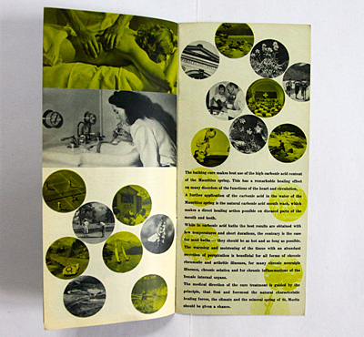
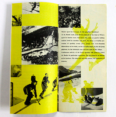
it employs a photomontage style in two colours, typical for the time.
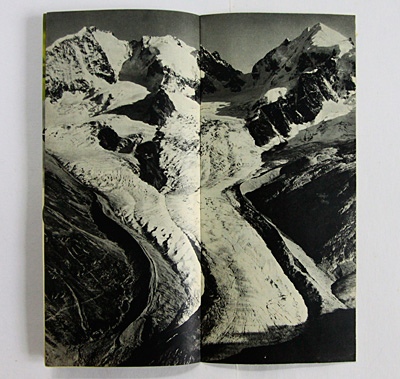
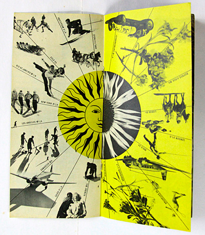
this leaflet is a summer and winter brochure in one. you can start reading it from either side, very much like book 681. the centerfold acts as a "pivot".
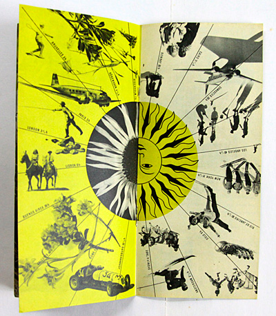
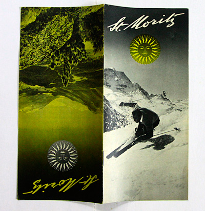
below the "winter" cover, ...
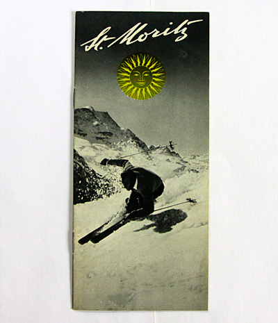
... featuring a spectacular photo of a downhill skier.
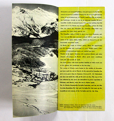
note the "swiss" tendancy to visually organize around a grid of squares.
here again the pivoting centerfold, this time turned 180°. note how the (white) silver thistle blossom merges with the yellow sun!
the summer and winter covers back to back.
--------------------------------------
book (design) stories home
index of published book (design) stories
